Mobility Sensing and Data Analytics for Smart Cities

Kade Townsend
Dr. Jason Hallstrom and Dr. Jiannan Zhai

BACKGROUND INFORMATION
- Smart Cities
- Mobility Sensing
- Economic Development
- Service Optimization

MobIntel
How it works
- Sensors
- MAC Address
- RSSI
- Privacy-First
Challenges
- Unchecked Data
- Loss of Power
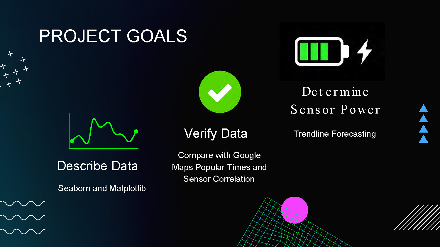
PROJECT GOALS
Describe Data
Seaborn and Matplotlib
Verify Data
Compare with Google Maps Popular Times and Sensor Correlation
Determine Sensor Power
Trendline Forecasting
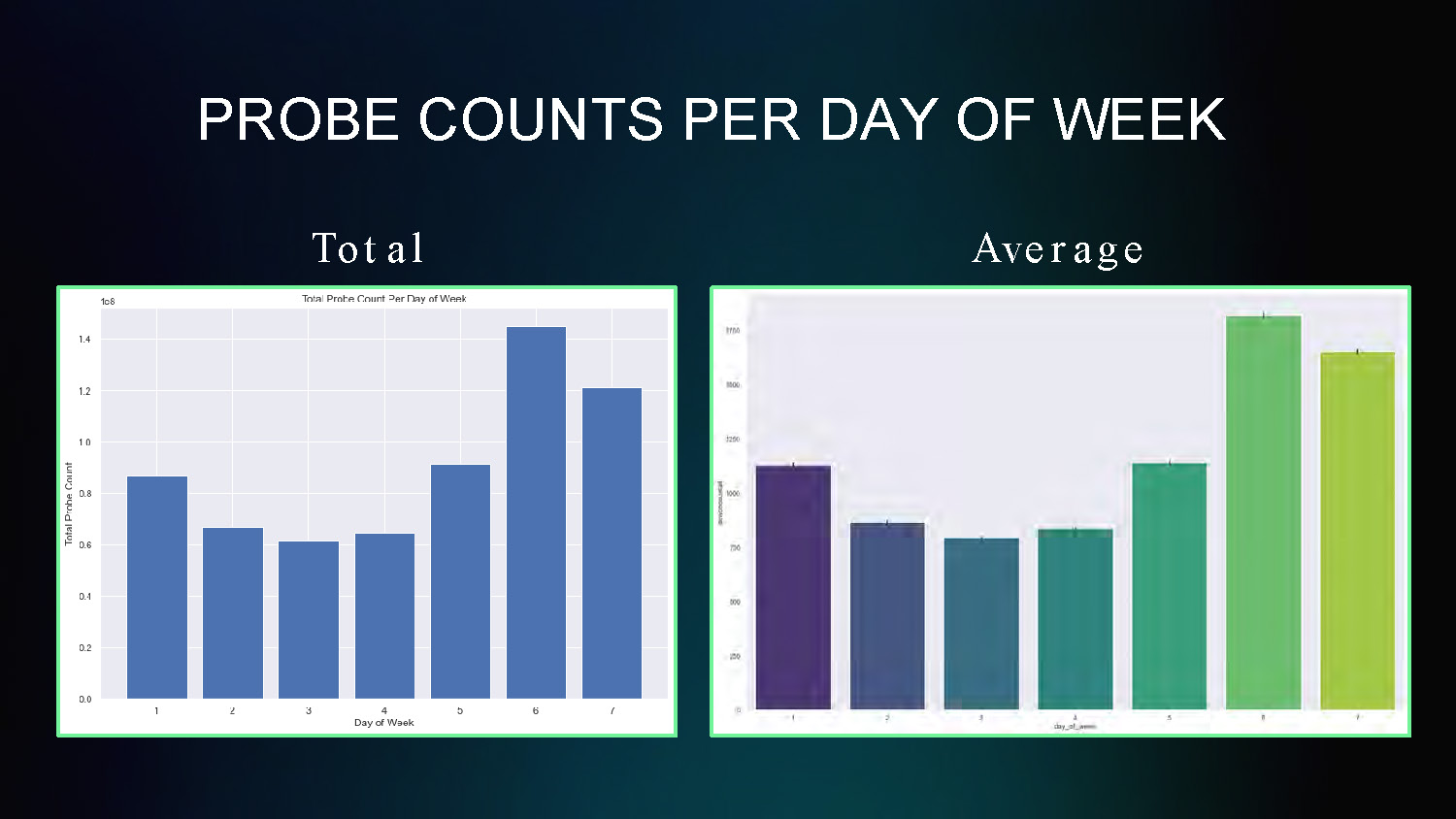
PROBE COUNTS PER DAY OF WEEK
Total and Average
This chart displays probe count data averaged across different days of the week, showing patterns in mobility sensing data collection by day.
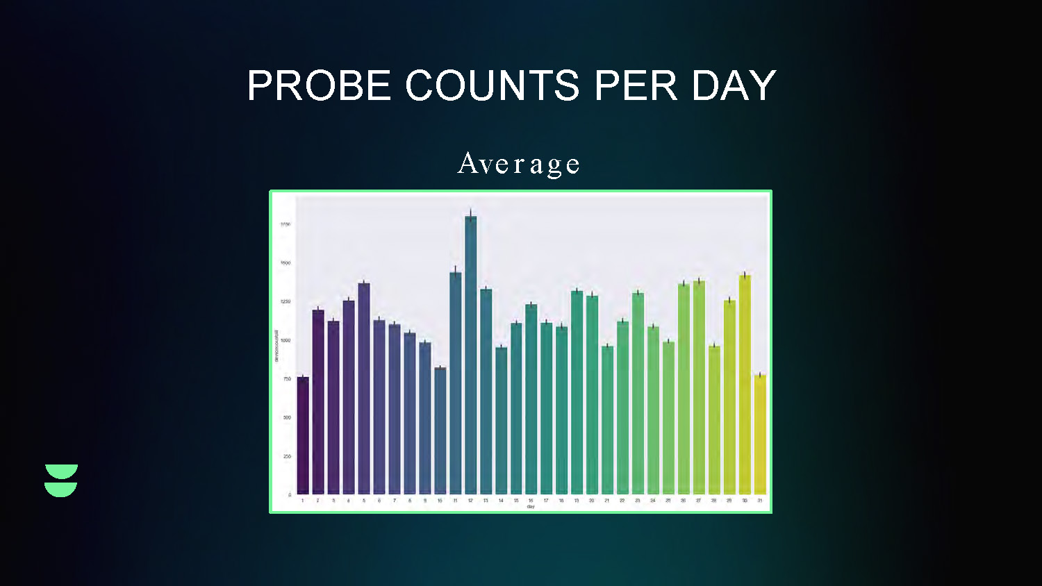
PROBE COUNTS PER DAY
Average
This line graph shows the daily variation in probe counts over time, displaying the average trend of mobility sensing data collection on a daily basis.
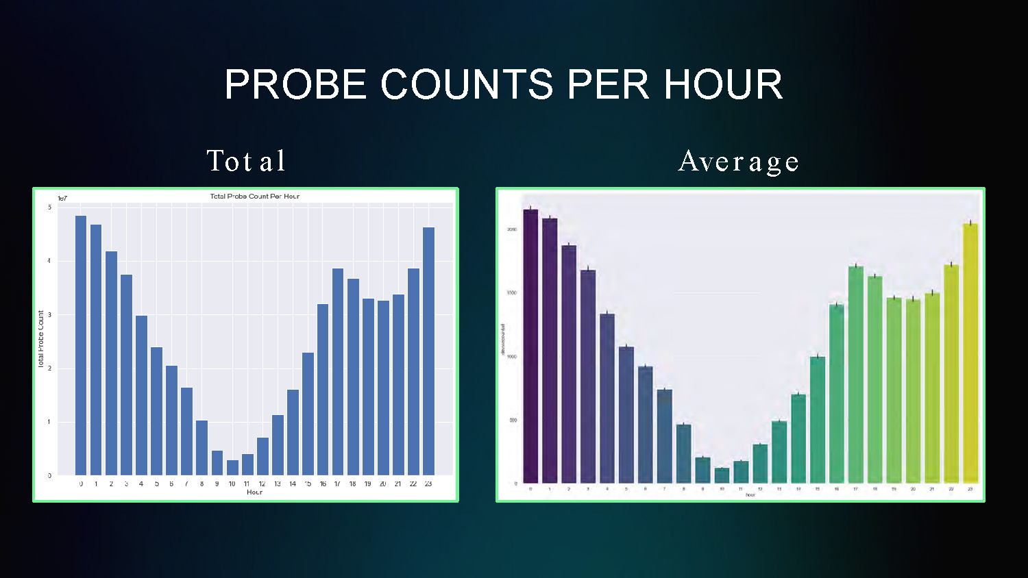
PROBE COUNTS PER HOUR
Total and Average
This chart shows the hourly distribution of probe counts throughout a 24-hour period, revealing patterns in mobility activity by hour of day.
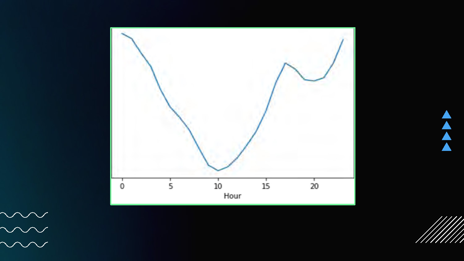
The image shows a line graph centered on a dark background with a green border. The x-axis is labeled "Hour" with ticks from 0 to 20. The y-axis has no label. A single blue line traces a curve on the graph, starting high on the left, dipping down to a low point around the 10-hour mark, and rising again towards the right. To the right of the graph are three blue triangles pointing to the right. The lower-left corner of the image contains three wavy, white horizontal lines. The bottom-right corner shows a small white shape with diagonal lines.
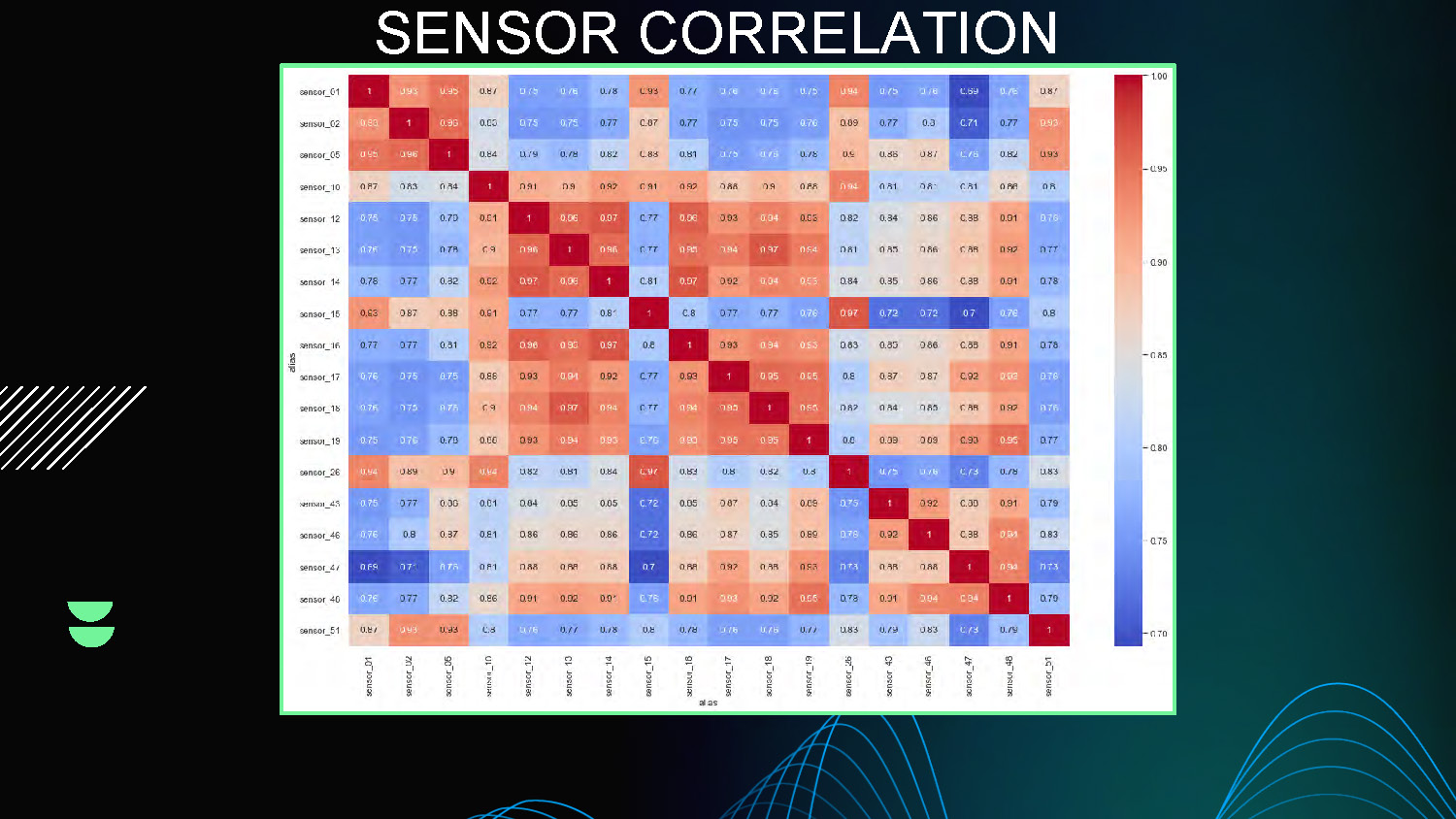
SENSOR CORRELATION
This slide presents correlation analysis between different sensors, showing relationships and patterns in the mobility sensing data through multiple visualization charts and correlation matrices.
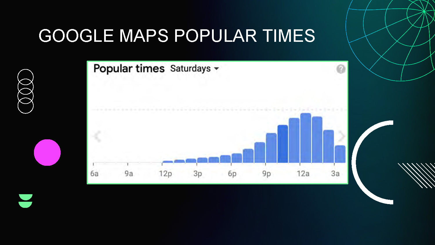
GOOGLE MAPS POPULAR TIMES
This slide shows comparison analysis between the mobility sensing data and Google Maps Popular Times data, used for validation and verification of the collected sensor data.

TRENDLINE FORECASTING
Calculating next value from trendline of previous data points
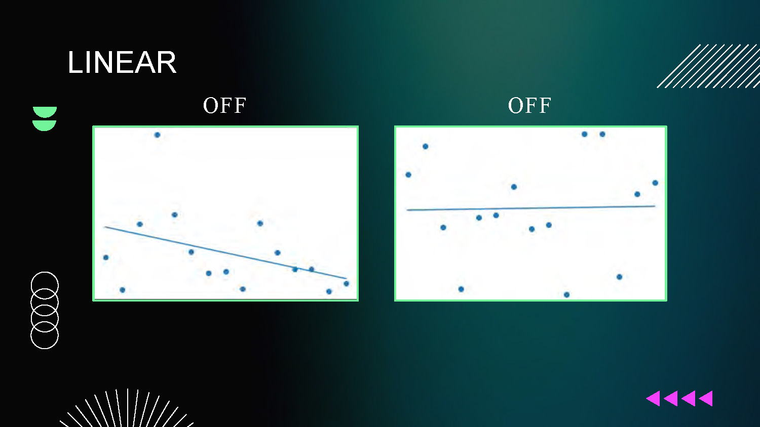
LINEAR
- First-Order
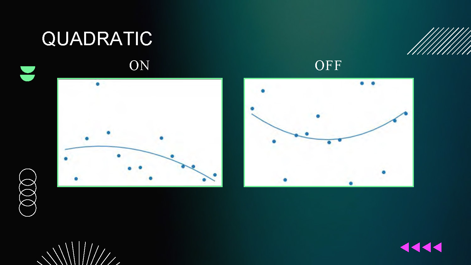
QUADRATIC
- Second-Order
Forecasting Results
LINEAR
OFF and OFF
Two scatter plot graphs showing linear model performance with off/off states
Forecasting Results
QUADRATIC
ON and OFF
Two scatter plot graphs showing quadratic forecasting models, with indicators showing which models are active (ON) or inactive (OFF) under different conditions.

FUTURE PROJECT GOALS
Machine Learning
Verify More Data

Thanks
Southwestern University
Florida Atlantic University
National Science Foundation

This presentation template was created by Slidesgo, and includes icons by Flaticon and infographics & images by Freepik
End of Presentation
Click the right arrow to return to the beginning of the slide show.
For a downloadable version of this presentation, email: I-SENSE@FAU.