Presentation: Load Demand Forecasting Using State-of-the-Art Modeling Methods: Focusing on Accuracy & Explainability
Load Demand Forecasting Using State-of-the-Art Modeling Methods: Focusing on Accuracy & Explainability
By Matthew Orellana
Advisor: Dr Zhen Ni
University: Florida Atlantic University
REU Year: 2024
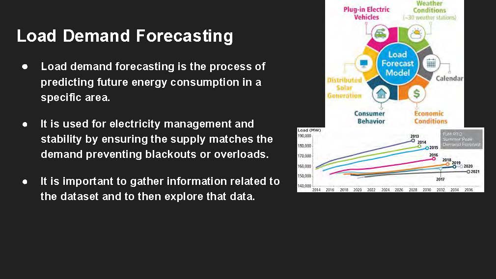
Load Demand Forecasting
Load demand forecasting is the process of predicting future energy consumption in a specific area.
It is used for electricity management and stability by ensuring the supply matches the demand preventing blackouts or overloads.
It is important to gather information related to the dataset and to then explore that data.
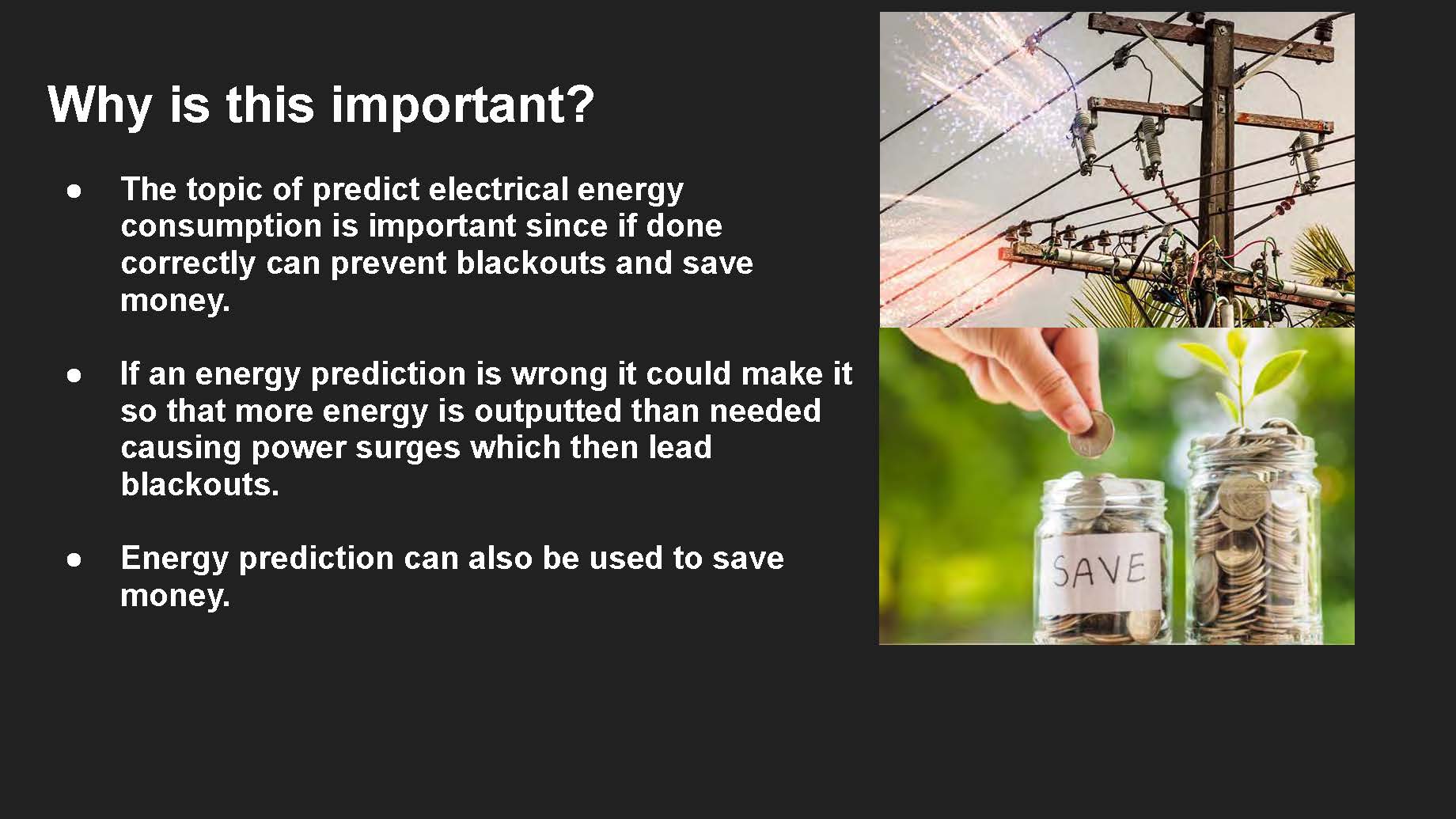
Why is this important?
The topic of predict electrical energy consumption is important since if done correctly can prevent blackouts and save money.
If an energy prediction is wrong it could make it so that more energy is outputted than needed causing power surges which then lead blackouts.
Energy prediction can also be used to save money.
Electric Power Consumption Dataset
Energy consumption for the city of Tetouan in morocco in 2017.
The capacity is measured in kilowatts per hour.
There are 52,416 observations of energy consumption on a 10 minute windows.
Source: https://www.kaggle.com/datasets/fedesoriano/electric-power-consumption/data
-
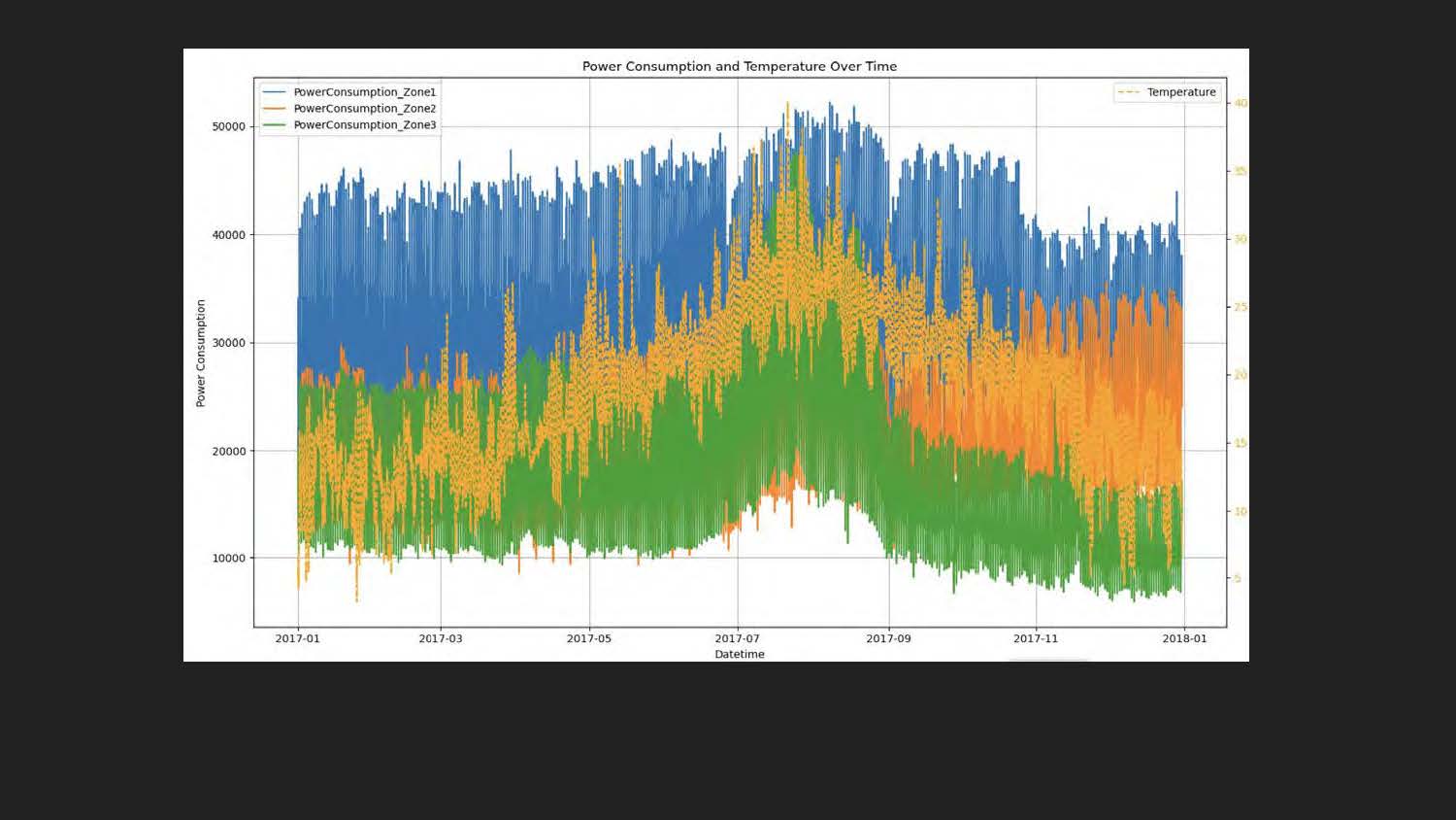
Power Consumption and Temperature Over Time
-
Y-axis (left): "Power Consumption"
-
X-axis: "Datetime"
-
Y-axis (right): "Temperature"
-
Legend (top left):
-
PowerConsumption_Zone1 (blue)
-
PowerConsumption_Zone2 (green)
-
PowerConsumption_Zone3 (orange)
-
Temperature (dashed yellow line)
-
-
Graph: A stacked area chart of power consumption for three zones with a yellow dashed line overlaid representing temperature. Datetime runs from 2017-01 to 2018-01.
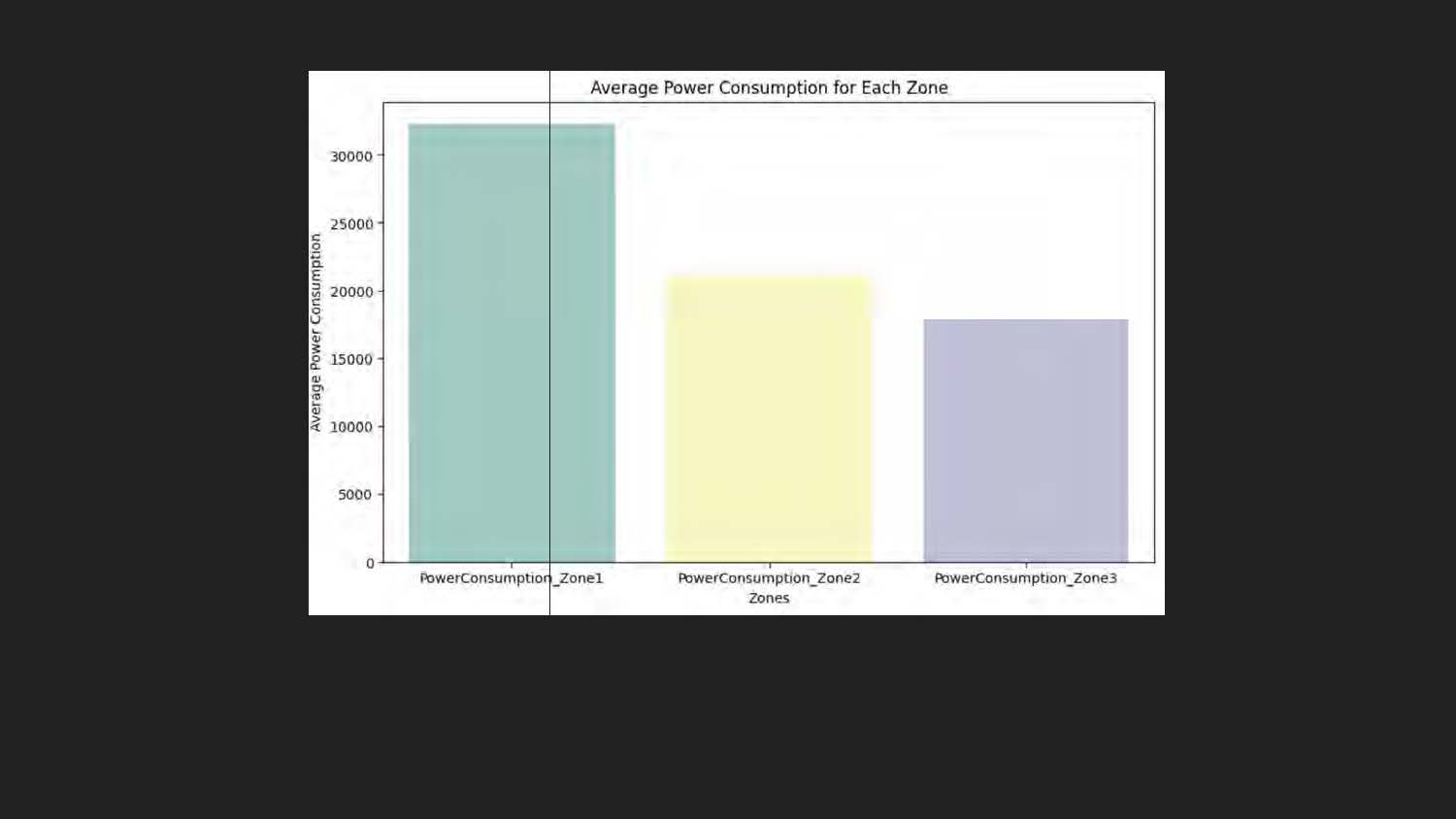
Average Power Consumption Bar Chart
A bar chart titled "Average Power Consumption for Each Zone." The x-axis is labeled "Zones" and shows three categories: PowerConsumption_Zone1, PowerConsumption_Zone2, and PowerConsumption_Zone3. The y-axis is labeled "Average Power Consumption." There are three vertical bars, each a different color (teal, yellow, and light purple), representing the average power consumption for each of the three zones.
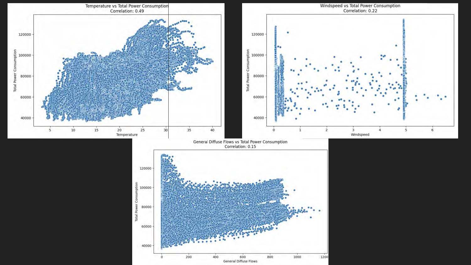
This image contains three scatter plots with correlation values.
-
Top left plot
-
Title: "Temperature vs Total Power Consumption"
-
Subtitle: "Correlation: 0.49"
-
X-axis: "Temperature"
-
Y-axis: "Total Power Consumption"
-
Data: Dense scatter distribution ranging from Temperature ~5 to ~40 and Total Power Consumption ~40,000 to ~120,000.
-
-
Top right plot
-
Title: "Windspeed vs Total Power Consumption"
-
Subtitle: "Correlation: 0.22"
-
X-axis: "Windspeed"
-
Y-axis: "Total Power Consumption"
-
Data: Sparse scatter distribution, Windspeed values between ~0 and ~6, Total Power Consumption between ~40,000 and ~120,000.
-
-
Bottom plot
-
Title: "General Diffuse Flows vs Total Power Consumption"
-
Subtitle: "Correlation: 0.15"
-
X-axis: "General Diffuse Flows"
-
Y-axis: "Total Power Consumption"
-
Data: Dense scatter distribution, General Diffuse Flows from ~0 to ~1200, Total Power Consumption from ~40,000 to ~120,000.
-
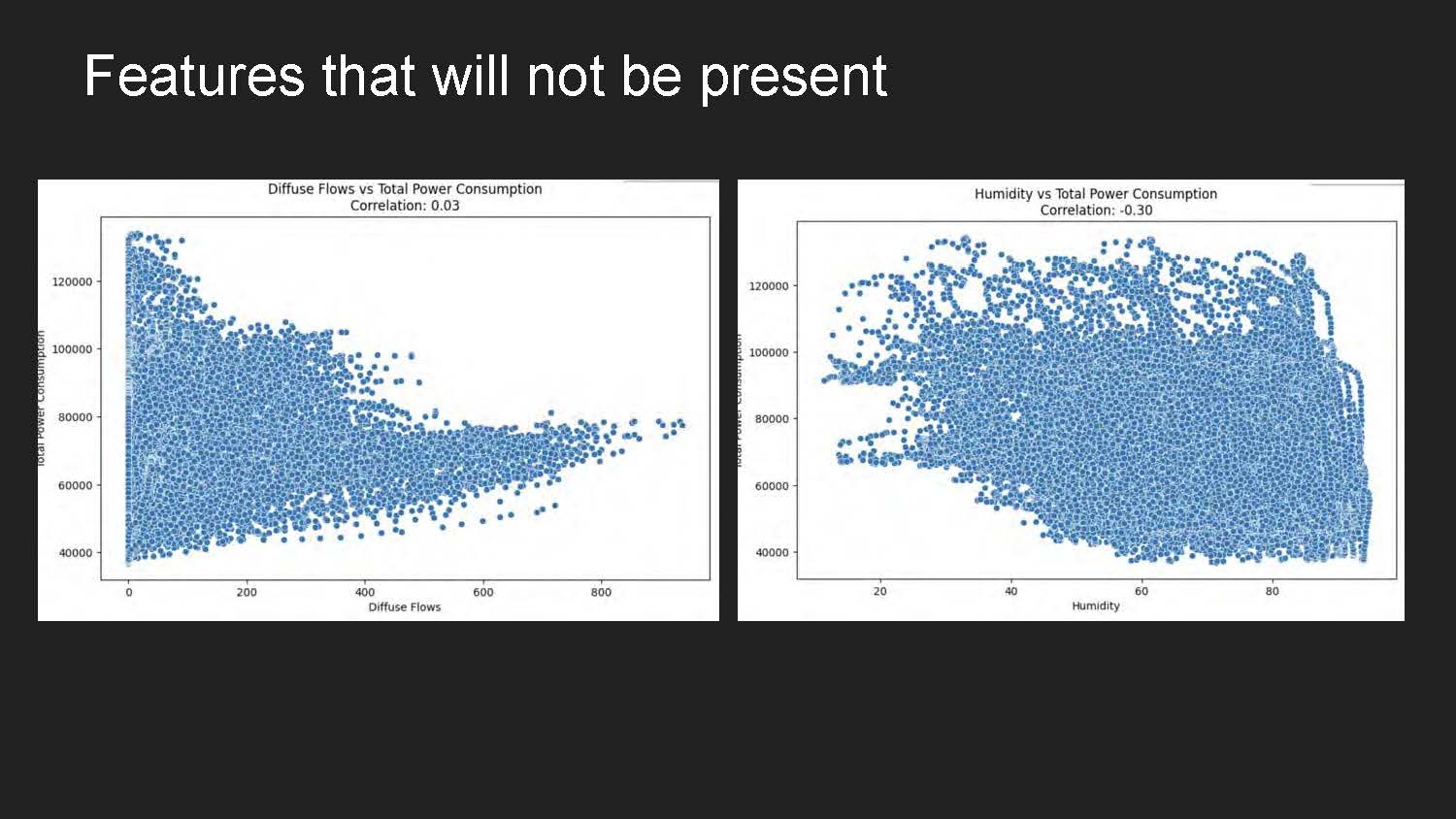
Features that will not be present
Two scatter plots. The left plot is titled "Diffuse Flows vs Total Power Consumption" with a correlation of 0.03. The right plot is titled "Humidity vs Total Power Consumption" with a correlation of -0.30. Both plots show a large number of blue data points scattered across the graphs, representing the relationship between the variables on their respective x and y axes.
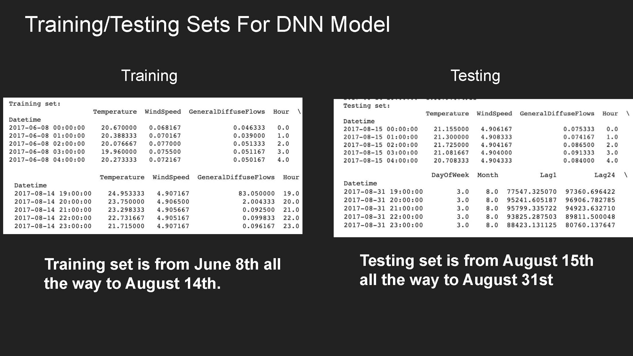
Training/Testing Sets For DNN Model
Training Set
| Datetime | Temperature | WindSpeed | GeneralDiffuseFlows | Hour |
|---|---|---|---|---|
| 2017-06-08 00:00:00 | 20.67000 | 0.068167 | 0.046333 | 0.0 |
| 2017-06-08 01:00:00 | 20.388333 | 0.070167 | 0.039000 | 1.0 |
| 2017-06-08 02:00:00 | 20.076667 | 0.077000 | 0.051333 | 2.0 |
| 2017-06-08 03:00:00 | 19.960000 | 0.075500 | 0.051167 | 3.0 |
| 2017-06-08 04:00:00 | 20.273333 | 0.072167 | 0.050167 | 4.0 |
| Datetime | Temperature | WindSpeed | GeneralDiffuseFlows | Hour |
|---|---|---|---|---|
| 2017-08-14 19:00:00 | 24.953333 | 4.907167 | 83.050000 | 19.0 |
| 2017-08-14 20:00:00 | 23.750000 | 4.906500 | 2.004333 | 20.0 |
| 2017-08-14 21:00:00 | 23.298333 | 4.905667 | 0.092500 | 21.0 |
| 2017-08-14 22:00:00 | 22.731667 | 4.905167 | 0.099833 | 22.0 |
| 2017-08-14 23:00:00 | 21.715000 | 4.907167 | 0.096167 | 23.0 |
Training set is from June 8th all the way to August 14th.
Testing Set:
| Datetime | Temperature | WindSpeed | GeneralDiffuseFlows | Hour |
|---|---|---|---|---|
| 2017-08-15 00:00:00 | 21.155000 | 4.906167 | 0.075333 | 0.0 |
| 2017-08-15 01:00:00 | 21.300000 | 4.908333 | 0.074167 | 1.0 |
| 2017-08-15 02:00:00 | 21.725500 | 4.904167 | 0.086500 | 2.0 |
| 2017-08-15 03:00:00 | 21.081667 | 4.904000 | 0.091333 | 3.0 |
| 2017-08-15 04:00:00 | 20.708333 | 4.904333 | 0.084000 | 4.0 |
| Datetime | DayOfWeek | Month | Lag1 | Lag24 |
|---|---|---|---|---|
| 2017-08-31 19:00:00 | 3.0 | 8.0 | 77547.325070 | 97360.496422 |
| 2017-08-31 20:00:00 | 3.0 | 8.0 | 95241.605187 | 96906.782785 |
| 2017-08-31 21:00:00 | 3.0 | 8.0 | 95799.335722 | 94923.632710 |
| 2017-08-31 22:00:00 | 3.0 | 8.0 | 93825.287503 | 89811.500048 |
| 2017-08-31 23:00:00 | 3.0 | 8.0 | 88423.131125 | 80760.137647 |
Testing set is from August 15th all the way to August 31st.
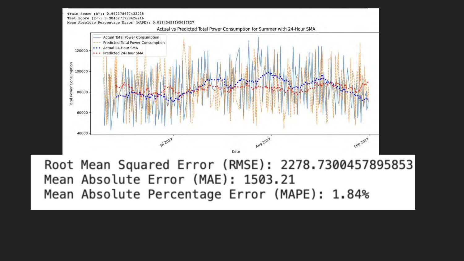
This is a time series graph. Specifically, it's a line plot that shows how power consumption changes over a period of time, from July to September 2017.
-
Upper left text:
-
"Train Score (R²): 0.997376897432035"
-
"Test Score (R²): 0.984627199426246"
-
"Mean Absolute Percentage Error (MAPE): 0.01843453163017827"
-
-
Title: "Actual vs Predicted Total Power Consumption for Summer with 24-Hour SMA"
-
X-axis: "Date" (labeled with Jul 2017, Aug 2017, Sep 2017)
-
Y-axis: "Total Power Consumption" (ranging from 40,000 to 120,000)
-
Legend:
-
Actual Total Power Consumption (blue line)
-
Predicted Total Power Consumption (orange line)
-
Actual 24-Hour SMA (dotted blue line)
-
Predicted 24-Hour SMA (dotted red line)
-
-
Bottom text (large bold style):
-
"Root Mean Squared Error (RMSE): 2278.7300457895853"
-
"Mean Absolute Error (MAE): 1503.21"
-
"Mean Absolute Percentage Error (MAPE): 1.84%"
-
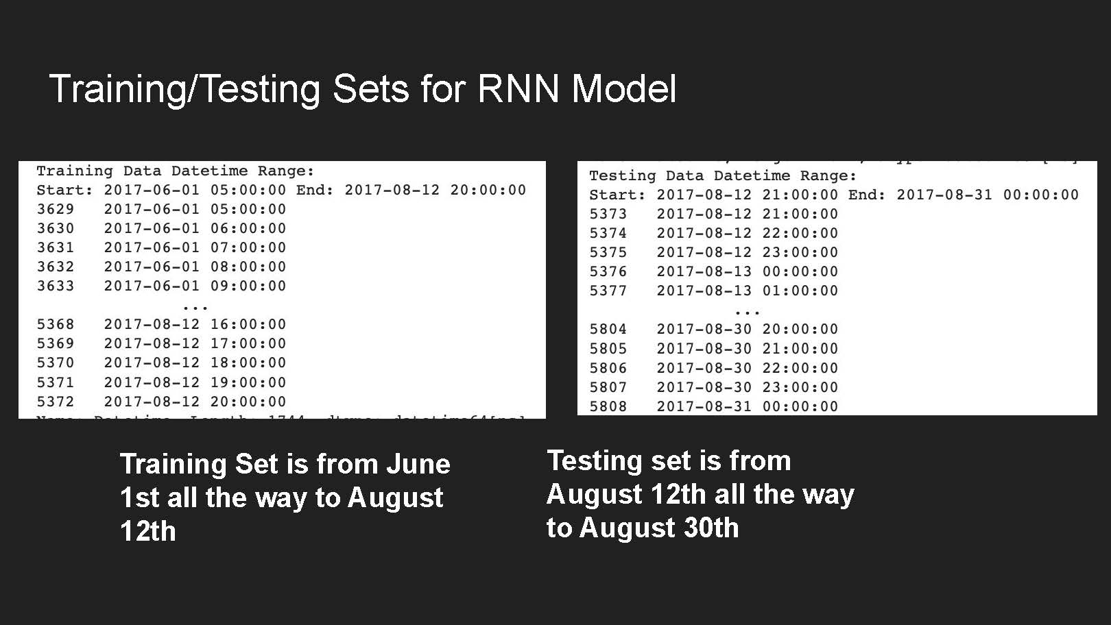
Training/Testing Sets For RNN Model
Training Data Datetime Range:
| Start: 2017-06-01 05:00:00 End: 2017-08-12 20:00:00 | |
| 3629 | 2017-06-01 05:00:00 |
| 3630 | 2017-06-01 06:00:00 |
| 3631 | 2017-06-01 07:00:00 |
| 3632 | 2017-06-01 08:00:00 |
| 3633 | 2017-06-01 09:00:00 |
| ... | |
| 5368 | 2017-08-12 16:00:00 |
| 5369 | 2017-08-12 17:00:00 |
| 5370 | 2017-08-12 18:00:00 |
| 5371 | 2017-08-12 19:00:00 |
| 5372 | 2017-08-12 20:00:00 |
Training set is from June 1st all the way to August 12th.
Testing Data Datetime Range:
| Start: 2017-08-12 21:00:00 End: 2017-08-31 00:00:00 | |
| 5373 | 2017-08-12 21:00:00 |
| 5374 | 2017-08-12 22:00:00 |
| 5375 | 2017-08-12 23:00:00 |
| 5376 | 2017-08-13 00:00:00 |
| 5377 | 2017-08-13 01:00:00 |
| ... | |
| 5804 | 2017-08-30 20:00:00 |
| 5805 | 2017-08-30 21:00:00 |
| 5806 | 2017-08-30 22:00:00 |
| 5807 | 2017-08-30 23:00:00 |
| 5808 | 2017-08-31 00:00:00 |
Testing set is from August 12th all the way to August 30th.
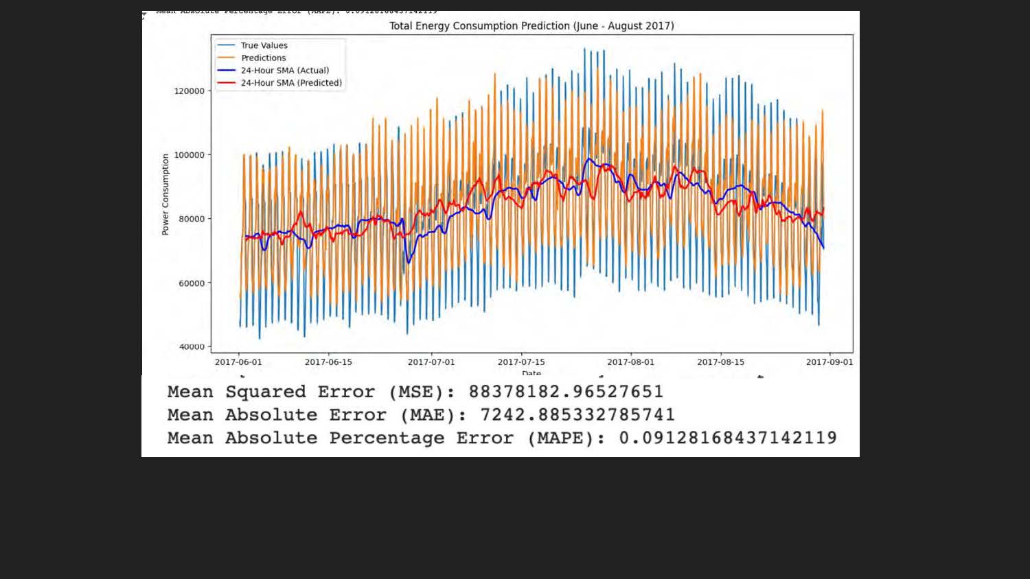
A line graph titled "Total Energy Consumption Prediction (June - August 2017)." The graph displays four
lines: a blue line labeled "True Values," an orange line labeled "Predictions," a red line labeled
"24-Hour SMA (Actual)," and a blue line labeled "24-Hour SMA (Predicted)." The x-axis is labeled "Date"
and the y-axis is labeled "Power Consumption." Below the graph, three metrics are listed with their
corresponding numerical values:
Mean Squared Error (MSE)
Mean Absolute Error (MAE)
Mean Absolute Percentage Error (MAPE)
Conclusion
Used the RNN and DNN model to try to predict energy consumption as accurate as possible.
Got close to accurate results with the DNN model.
Discovered that summer tends to be the month where energy consumption is at its highest.
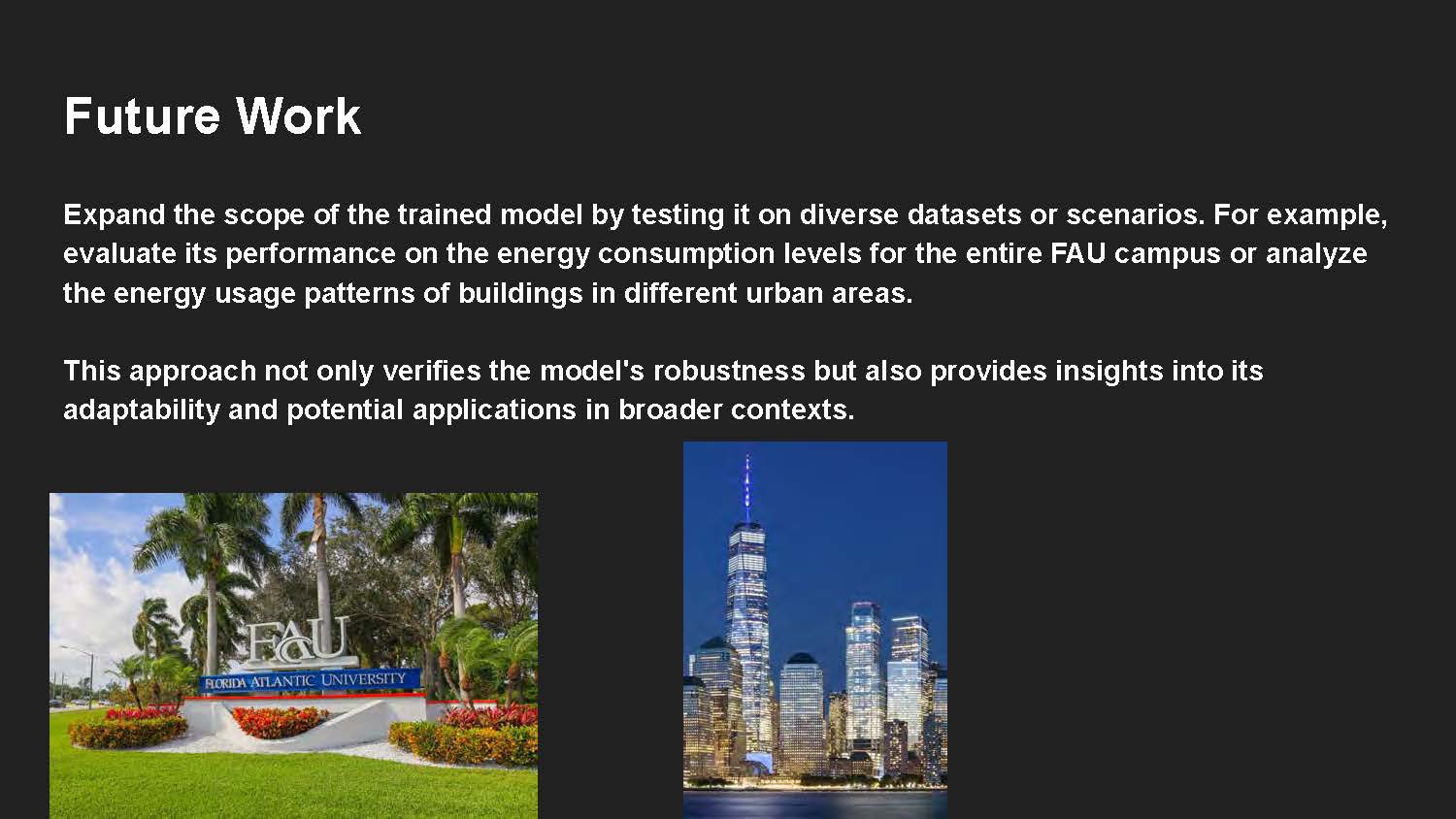
Future Work
Expand the scope of the trained model by testing it on diverse datasets or scenarios. For example, evaluate its performance on the energy consumption levels for the entire FAU campus or analyze the energy usage patterns of buildings in different urban areas.
This approach not only verifies the model's robustness but also provides insights into its adaptability and potential applications in broader contexts.

End of Presentation
Click the right arrow to return to the beginning of the slide show.
For a downloadable version of this presentation, email: I-SENSE@FAU.