Capturing Pedestrian Energy

Slide contains a blank red video placeholder with video icon on lower left.

PIEZOELECTRICITY
Slide contains a blank red video placeholder on the left and a lightbulb on the upper right above the title.

HOW CAN THIS BE USEFUL?
Streetlights
Traffic Lights
Displays
Smart City Monitoring Components
The slide displays visual icons representing each application: a streetlight pole, traffic light system, electronic display screen, and various smart city monitoring devices and sensors.

Current Uses

Field Research

CS3 Collaboration
Equations
σ = F/A
σ = Stress (Pa)
F = Force (N)
A = Area of piezo surface pressed (m²)
V = g_33 x σ x d
V = Voltage
σ = Stress (Pa)
g_33 = piezoelectric voltage coefficient - voltmeter per Newton (Vm/N)
d = thickness of the piezoelectric material (m)
I = V/R
I = Current (A)
V = Voltage
R = Resistance (ohms)
P = V x I
P = Power (W)
V = Voltage
I = Current (A)
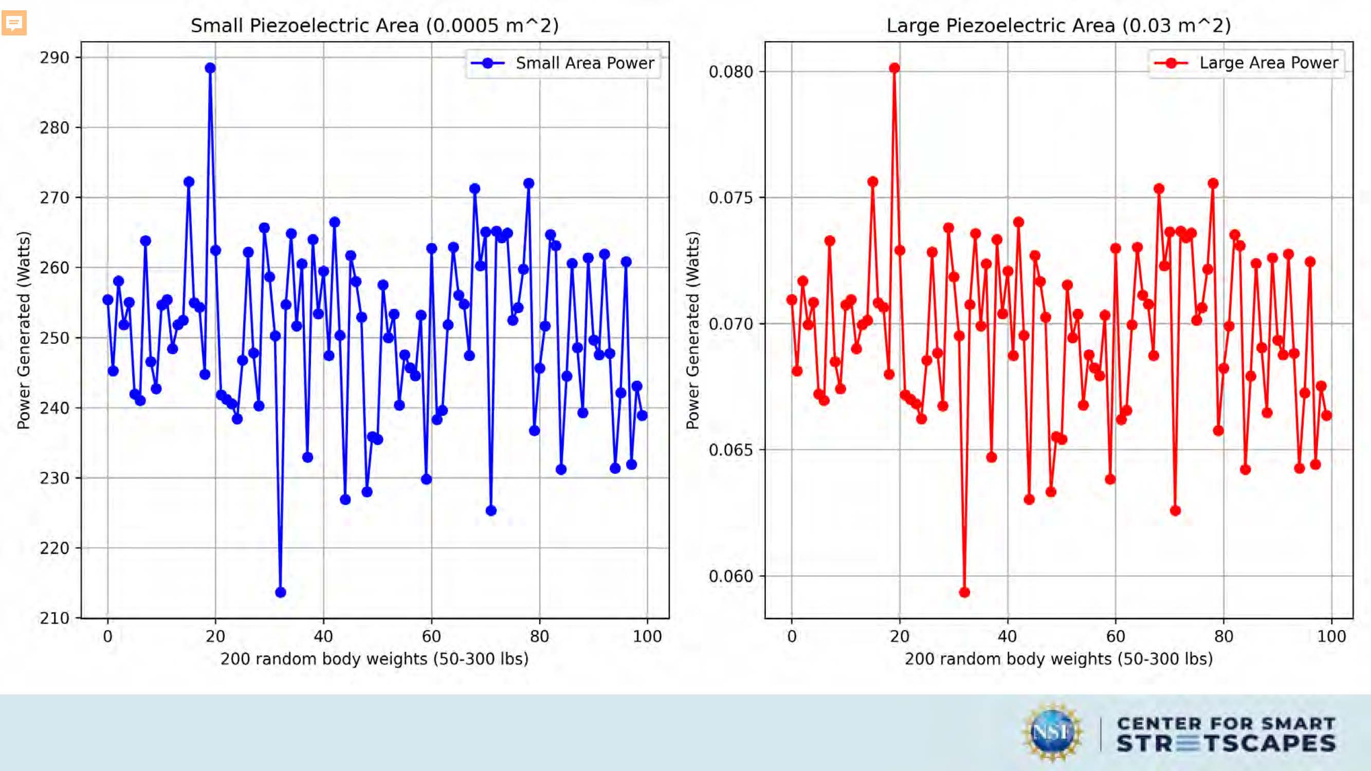
The image shows two line graphs each representing different scenarios of piezoelectric area used for generating power under varying random body weights.
Graph on the Left:
- Title: "Small Piezoelectric Area (0.0005 m^2)"
- Legend: Two lines, one for "Small Area Power" and another for "Large Area Power". The "Small Area
Power" is
represented by blue dots while the "Large Area Power" by red dots.
- X-Axis: Labels 200 random body weights ranging from approximately 50 to 300 lbs.
- Y-Axis: Measures 'Power Generated (Watts)' between approximately 210 to 290 watts.
This graph illustrates the power generated at different random body weights for a small piecezoelectric area. There are noticeable fluctuations in the power output at various weights, but generally, the power remains within the specified range.
Graph on the Right:
- Title: "Large Piezoelectric Area (0.03 m^2)"
- Legend: Again, there are two lines - one for "Small Area Power" in blue dots and one for "Large Area
Power" in red
dots.
- X-Axis: Same as left graph with 200 random body weights.
- Y-Axis: Represents the same 'Power Generated (Watts)' range as in the left graph, between
approximately 210 to 290
watts.
This graph presents similar patterns of power fluctuation as the left graph, however, with a larger piezoelectric area (0.03 m^2), the power seems to have higher peaks indicating more significant variations in power generation across the weight ranges tested.

3D Model
In the center, there is a large heading labeled "3D MODEL".
Below the title "3D MODEL", there are three separate images or thumbnails:
- The first (on the left) is a 3D modeling software interface. It looks like a user is creating or
editing a 3D model
which appears to be a conical or pyramidal structure. There are various tools and options visible on the
software's
toolbar, suggesting it could be a program or CAD (Computer-Aided Design) tool.
- The second (in the middle) shows a white, abstract 3D object with sharp angles and right-angled
lines converging at a
central point. It resembles a geometric shape that might not have a direct real-world correspondence.
- The third (on the right) is another abstract 3D shape, but this one has smoother curves and appears
more complex than
the second, featuring multiple connected planes and angles.

Experiment
Image of wooden frames, tools, wires;.a dark red video placeholder with video icon in lower left
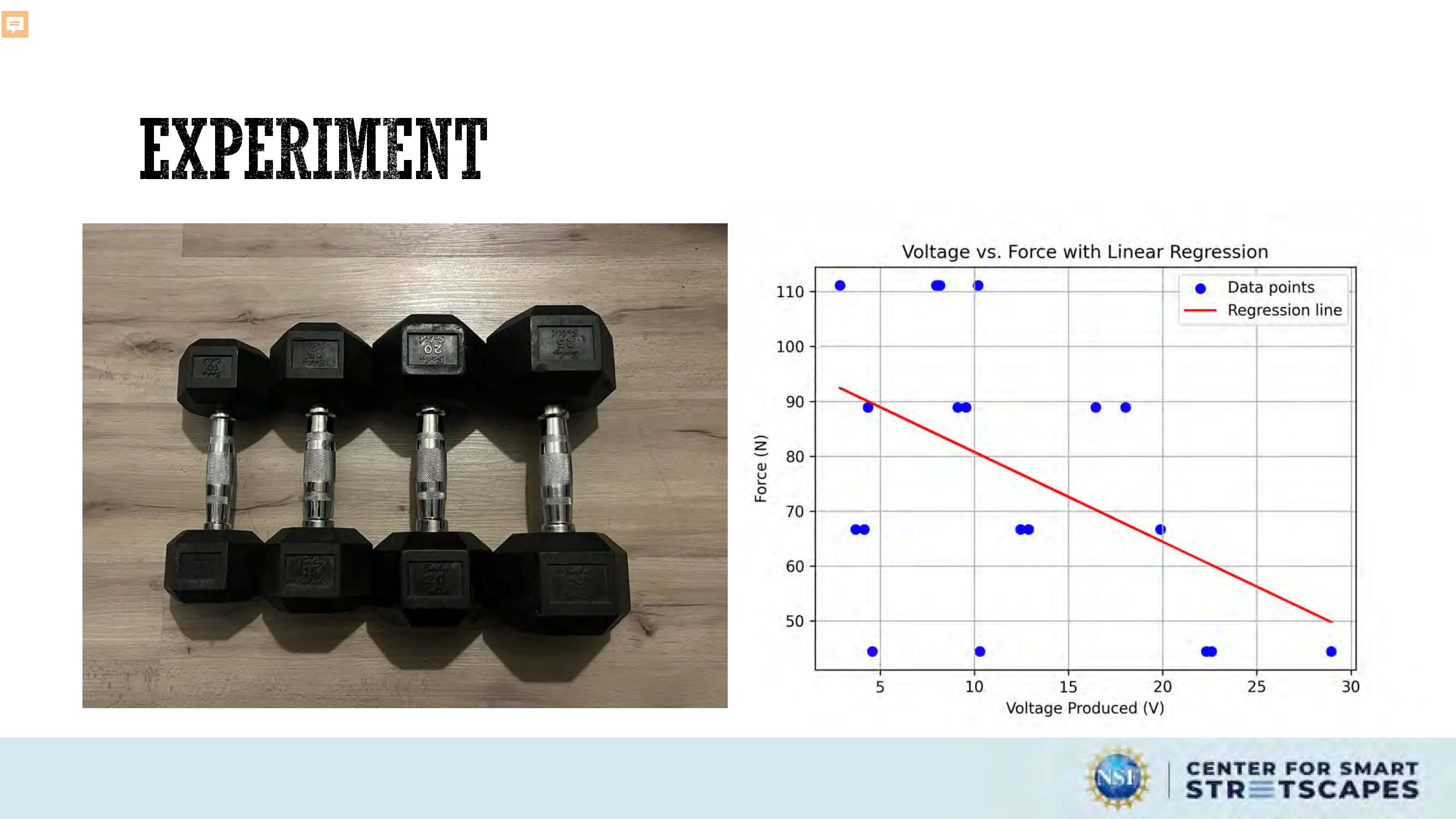
Experiment
A graph displaying a scatter plot of voltage versus force, with a linear regression line overlaid, is presented.
The scene composition is a scatter plot, showing a set of data points plotted against voltage and force. A regression line is overlaid on the scatter plot, along with a predicted data point. The x-axis represents the voltage produced, and the y-axis represents the force in Newtons. The graph is clearly labeled with titles, axis labels, and legend identifying the data points, regression line, and predicted point.
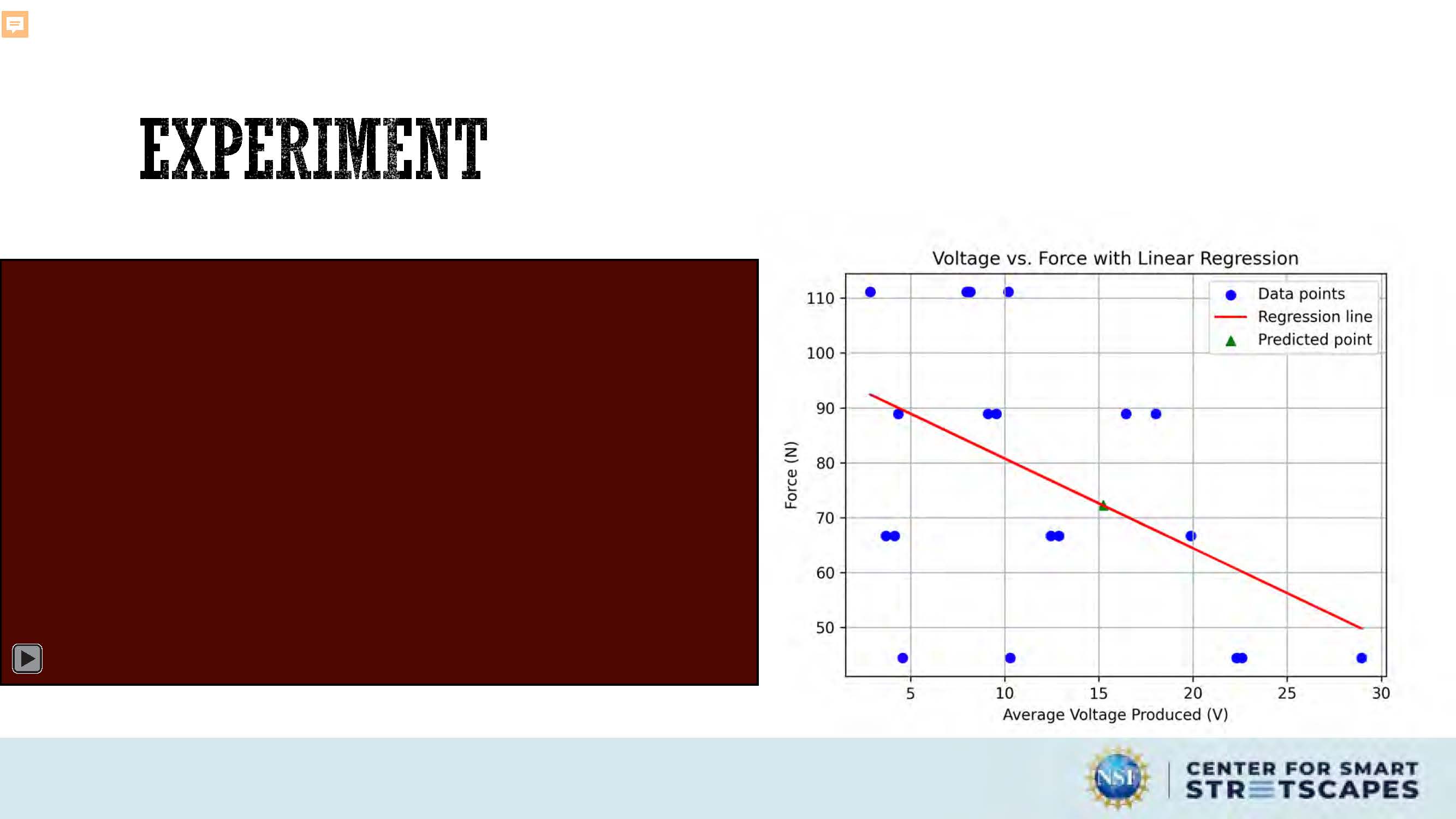
Experiment
A graph displaying a scatter plot of voltage versus force, with a linear regression line overlaid, is presented.
The scene composition is a scatter plot, showing a set of data points plotted against average voltage and force. A regression line is overlaid on the scatter plot, along with a predicted data point. The x-axis represents the average voltage produced, and the y-axis represents the force in Newtons. The graph is clearly labeled with titles, axis labels, and legend identifying the data points, regression line, and predicted point.
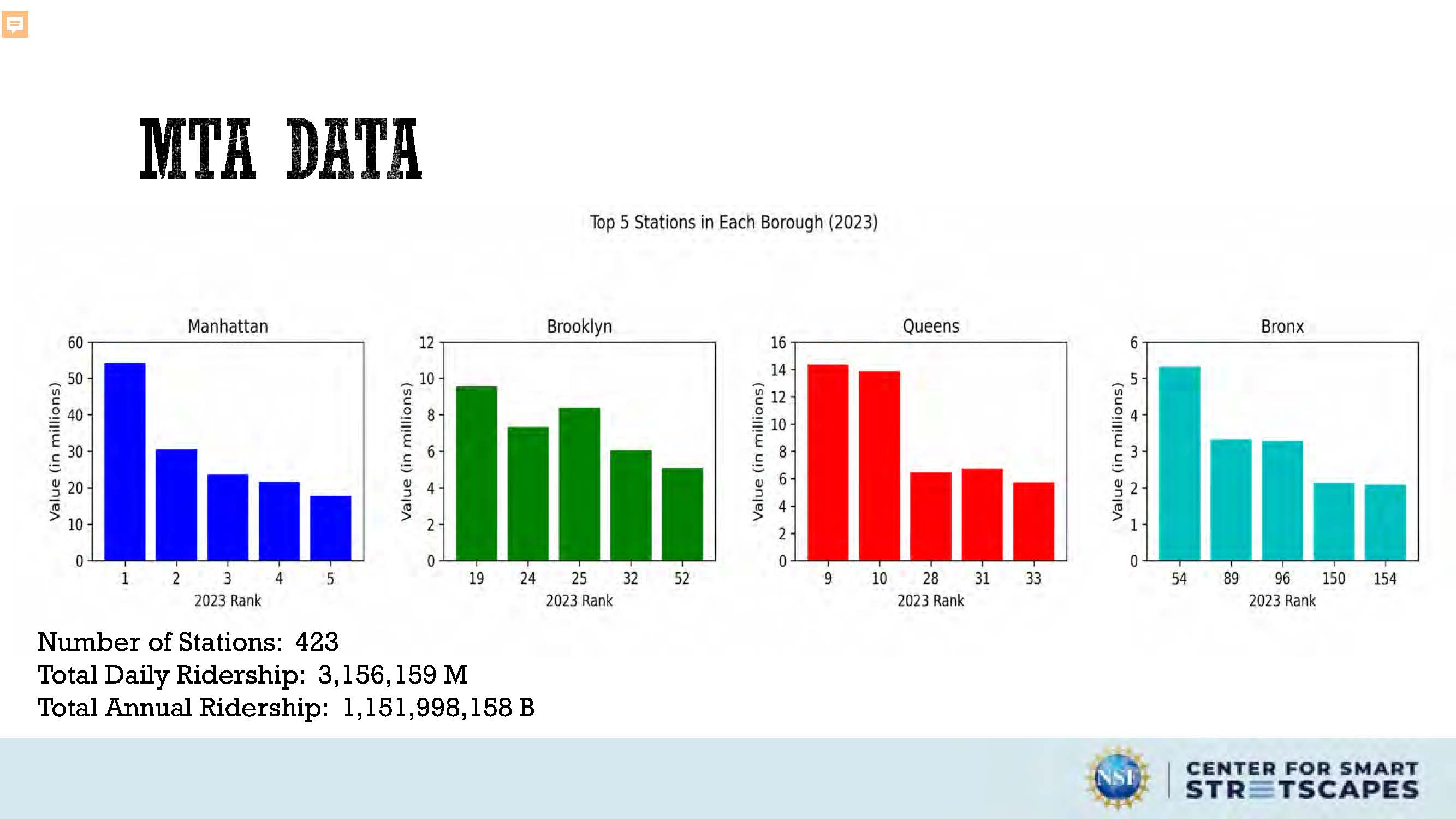
MTA Data
Number of Stations: 423
Total Daily Ridership: 3,156,159 M
Total Annual Ridership: 1,151,998,158 B
The image is a data visualization, specifically a collection of bar charts, displaying ridership data for the Metropolitan Transportation Authority (MTA). The title "MTA DATA" is prominently displayed at the top. Below this, a subtitle reads "Top 5 Stations in Each Borough (2023)."
The main body of the image consists of four vertically aligned bar charts, one for each of New York City's boroughs: Manhattan, Brooklyn, Queens, and the Bronx. Each chart shows the top five stations ranked by ridership in millions. The bars are color-coded for easy distinction: Manhattan is blue, Brooklyn is green, Queens is red, and the Bronx is turquoise. The x-axis of each chart represents the station's rank (1-5), and the y-axis indicates the ridership in millions. Numbers on the axes are clearly labeled.
Below the charts, three lines of quantitative data are presented: "Number of Stations: 423," "Total Daily Ridership: 3,156,159 M," and "Total Annual Ridership: 1,151,998,158 B." These numbers provide context and a broader overview of the MTA system's usage.
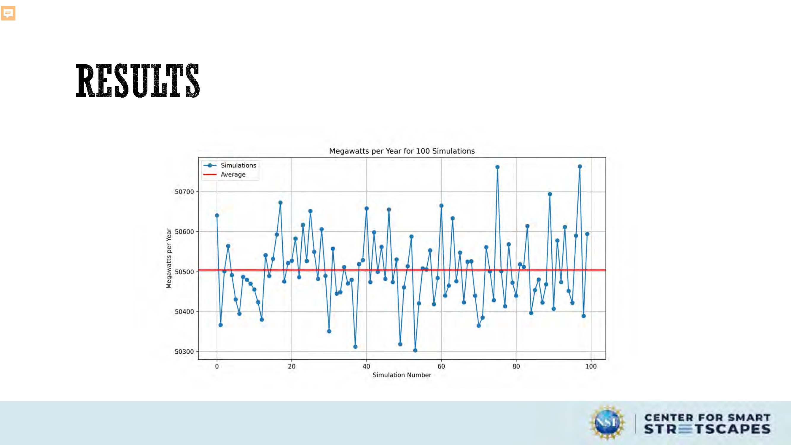
Results
A graph displays megawatts per year for 100 simulations, with each simulation's megawatts plotted against its simulation number. A horizontal line represents the average megawatts across all simulations.

Results
Quote: "On average, NYC uses about 5,500 megawatts of power (NYISO 2022). In the summer, as New Yorkers turn on their air conditioners, citywide demand can increase to as much as 10,000 megawatts. To meet our 100% clean energy goal while satisfying NYC's electricity demands, we will need to build new transmission lines to bring clean energy into NYC." – Mayor's Office of Climate & Environmental Justice
Slide contains diagram showing 50,500 (average megawatts per year) divided by 5,500 (NYC daily megawatt usage) = 9.18 days
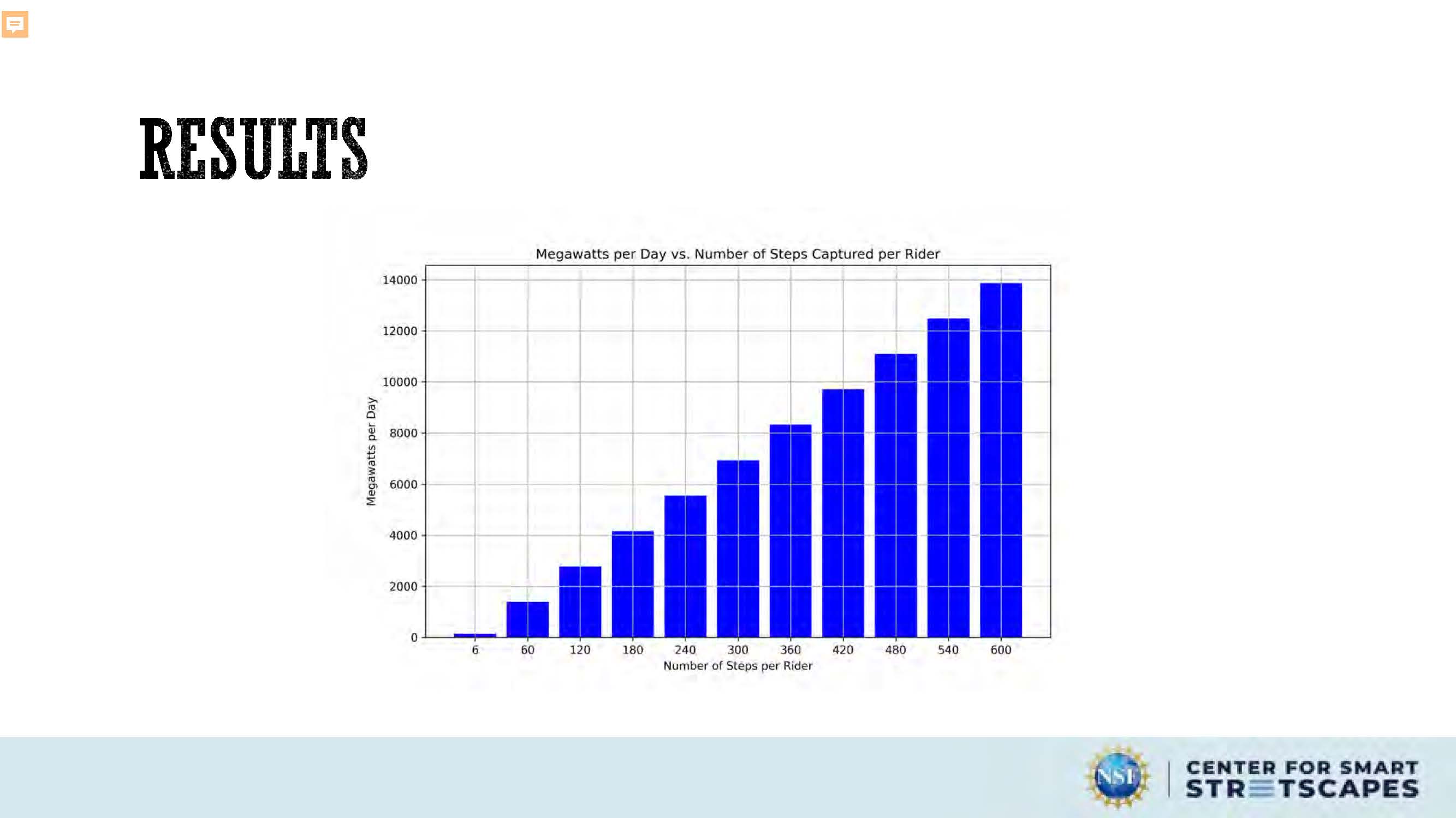
Results
Slide contains a bar graph in blue showing Megawatts per Day vs Number of Steps Captured per Rider

QUESTIONS & FEEDBACK

End of Presentation
Click the right arrow to return to the beginning of the slide show.
For a downloadable version of this presentation, email: I-SENSE@FAU.