A Simple Framework for Contrastive Learning (SimCLR) for Human Activity Recognition (HAR) in individuals with Parkinson's Disease (PD)
Nidhi Begur and Annelies Verbist
Mentor: Behnaz Ghoraani, Ph.D.
OBJECTIVE
Currently, this project aims at creating an AI model based on the most recent advances of machine learning techniques that can acquire and analyze data from individuals with Parkinson's Disease and accurately identify when the individuals perform daily living activities.
Final Presentation 2
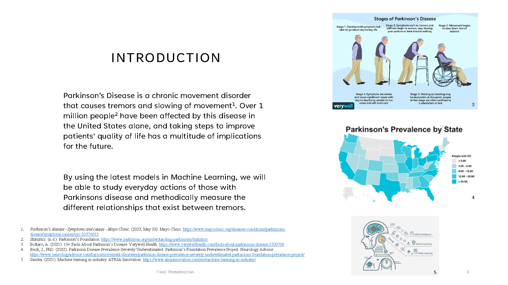
INTRODUCTION
Parkinson's Disease is a chronic movement disorder that causes tremors and slowing of movement. Over 1 million people have been affected by this disease in the United States alone, and taking steps to improve patients' quality of life has a multitude of implications for the future.
By using the latest models in Machine Learning, we will be able to study everyday actions of those with Parkinsons disease and methodically measure the different relationships that exist between tremors.
References:
1. Parkinson's disease - Symptoms and causes - Mayo Clinic. (2023, May 26). Mayo Clinic. https://www.mayoclinic.org/diseases-conditions/parkinsons-disease/symptoms-causes/syc-20376055
2. Statistics. (n.d.). Parkinson's Foundation. https://www.parkinson.org/understanding-parkinsons/statistics
3. Bottaro, A. (2021). 10+ Facts About Parkinson's Disease. Verywell Health. https://www.verywellhealth.com/facts-about-parkinsons-disease-5200700
4. Beck, J., PhD. (2022). Parkinson Disease Prevalence Severely Underestimated: Parkinson's Foundation Prevalence Project. Neurology Advisor. https://www.neurologyadvisor.com/topics/movement-disorders/parkinson-disease-prevalence-severely-underestimated-parkinsons-foundation-prevalence-project/
5. Sandra. (2021). Machine learning in industry. ATRIA Innovation. https://www.atriainnovation.com/en/machine-learning-in-industry/
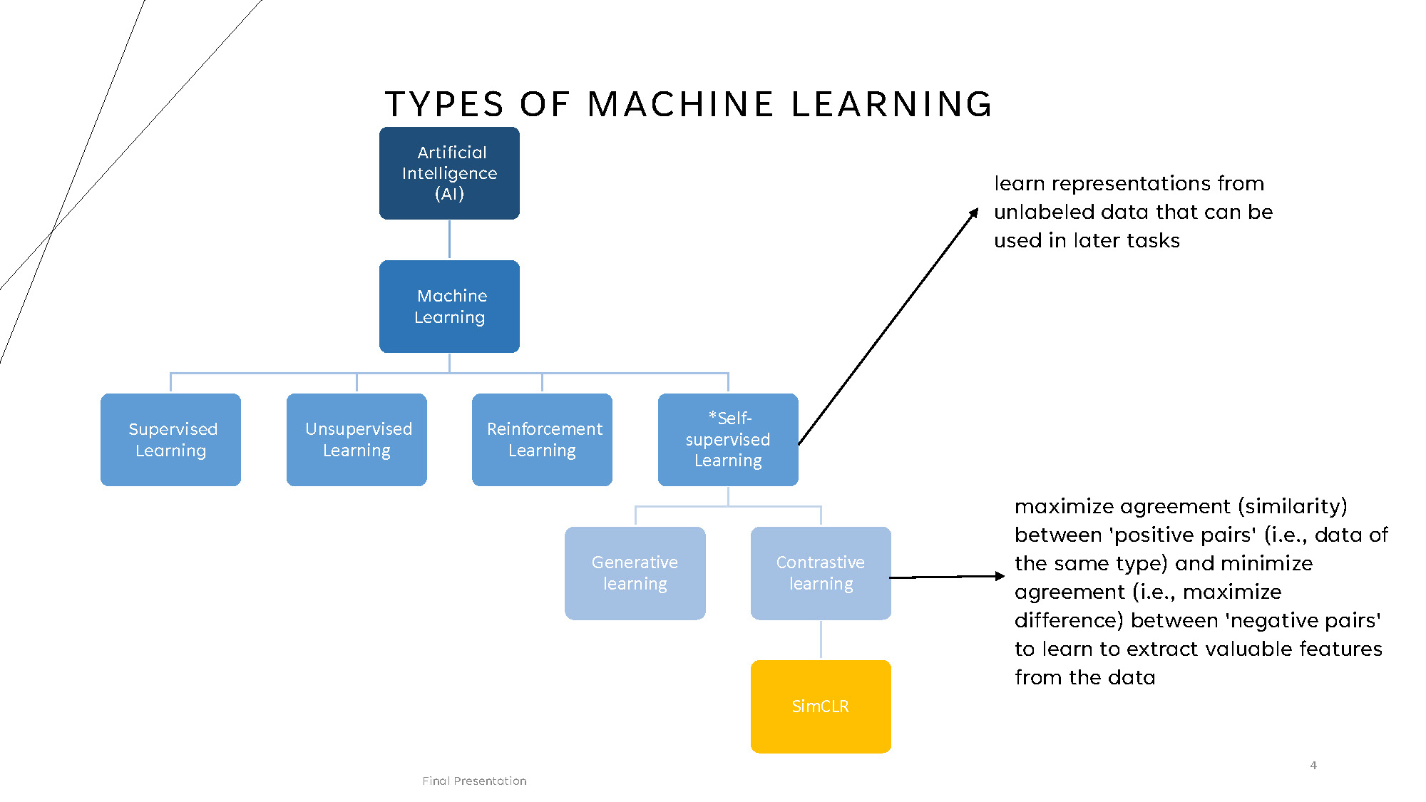
TYPES OF MACHINE LEARNING
Hierarchical structure showing:
Artificial Intelligence (AI) contains Machine Learning, which branches into:
- Supervised Learning
- Unsupervised Learning
- Reinforcement Learning
- *Self-supervised Learning (learn representations from unlabeled data that can be used in later tasks)
Self-supervised Learning includes Generative learning and Contrastive learning (maximize agreement (similarity) between 'positive pairs' (i.e., data of the same type) and minimize agreement (i.e., maximize difference) between 'negative pairs' to learn to extract valuable features from the data)
Contrastive learning contains SimCLR
REFERENCE RESEARCH
Chen, Ting, et al. "A simple framework for contrastive learning of visual representations." International conference on machine learning. PMLR, 2020.
- Concept introduced by Google
- Utilized for images
Tang, Chi Ian, et al. "Exploring contrastive learning in human activity recognition for healthcare." arXiv preprint arXiv:2011.11542 (2020).
- Used for HAR (Human Activity Recognition)
- Time Series Data
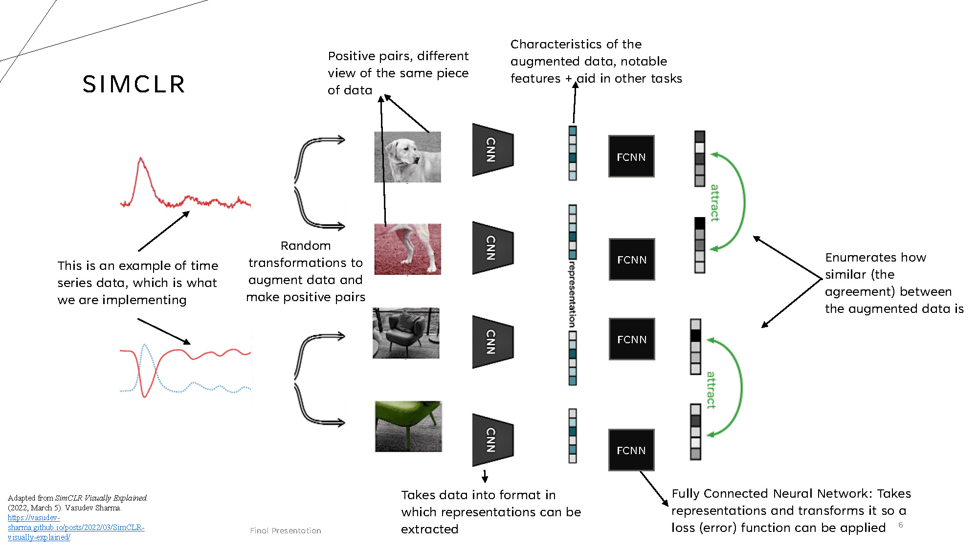
SIMCLR
Adapted from SimCLR Visually Explained. (2022, March 5). Vasudev Sharma. https://vasudev-sharma.github.io/posts/2022/03/SimCLR-visually-explained/
The SimCLR architecture shows the following flow:
- Random transformations to augment data and make positive pairs
- Positive pairs, different view of the same piece of data
- Takes data into format in which representations can be extracted
- Characteristics of the augmented data, notable features + aid in other tasks
- Fully Connected Neural Network: Takes representations and transforms it so a loss (error) function can be applied
- Enumerates how similar (the agreement) between the augmented data is
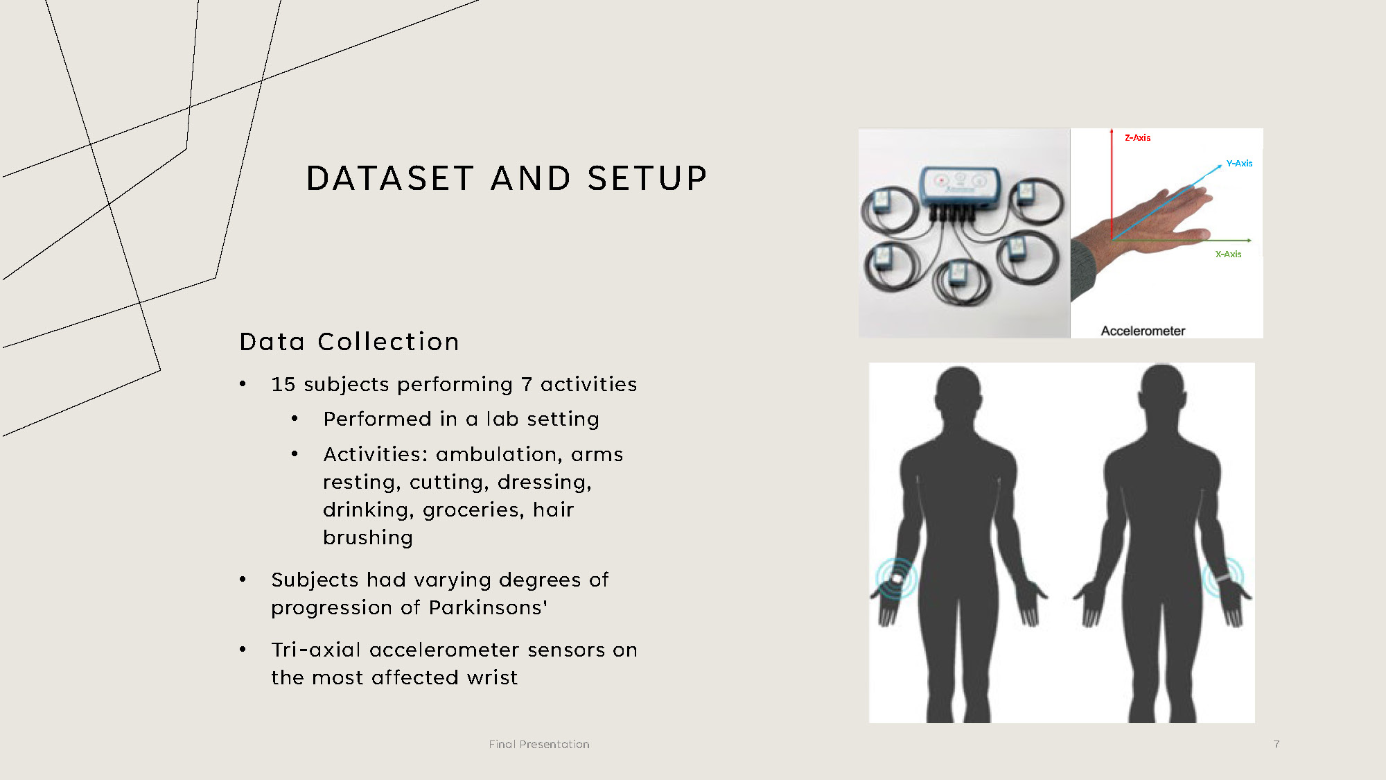
DATASET AND SETUP
Data Collection
- 15 subjects performing 7 activities
- Performed in a lab setting
- Activities: ambulation, arms resting, cutting, dressing, drinking, groceries, hair brushing
- Subjects had varying degrees of progression of Parkinsons'
- Tri-axial accelerometer sensors on the most affected wrist
METHODOLOGY
- Analyze and break down the SimCLR model components to understand function and impact on results
- Run the model on public dataset to achieve comparable results to Exploring Contrastive Learning in Human Activity Research for Healthcare
- Prepare and preprocess PD dataset to a utilizable format and finetuned the model as needed. Choose following transformations: noise, scaling, rotation, negation, time flip, permutation, time warp, and channel shuffle.
- Train the model and evaluate its performance by computing the F1 weighted score for every data transformation. The model is trained on 14 subjects and tested on one subject
- Compare to a fully supervised model under the same conditions as SimCLR as current state-of-the-art comparison
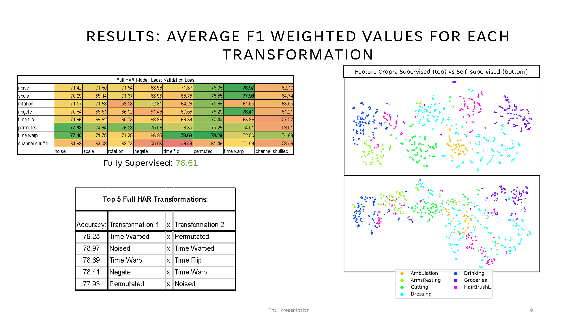
RESULTS: AVERAGE F1 WEIGHTED VALUES FOR EACH TRANSFORMATION
Full HAR Model: Least Validation Loss
| Transformation | noise | scale | rotation | negate | time flip | permuted | time warp | channel shuffled |
|---|---|---|---|---|---|---|---|---|
| noise | 71.42 | 71.80 | 71.54 | 68.98 | 71.37 | 76.08 | 78.97 | 62.17 |
| scale | 70.29 | 69.14 | 71.67 | 68.96 | 65.78 | 75.85 | 77.93 | 64.74 |
| rotation | 71.57 | 71.98 | 59.03 | 72.81 | 64.28 | 75.88 | 61.55 | 63.55 |
| negate | 70.84 | 66.51 | 66.02 | 61.49 | 67.58 | 75.20 | 78.41 | 61.21 |
| time flip | 71.86 | 69.92 | 65.73 | 68.96 | 68.33 | 75.44 | 63.96 | 57.27 |
| permuted | 77.93 | 74.94 | 76.28 | 75.56 | 73.35 | 75.29 | 74.01 | 59.51 |
| time warp | 77.40 | 71.75 | 71.35 | 66.25 | 78.69 | 79.28 | 72.50 | 74.83 |
| channel shuffle | 64.89 | 63.08 | 69.73 | 55.06 | 49.43 | 61.46 | 71.03 | 58.48 |
Fully Supervised: 76.61
Top 5 Full HAR Transformations:
- Accuracy: Transformation 1 x Transformation 2
- 79.28 Time Warped x Permutated
- 78.97 Noised x Time Warped
- 78.69 Time Warp x Time Flip
- 78.41 Negate x Time Warp
- 77.93 Permutated x Noised
The image shows two scatter plots stacked vertically within a single figure. The title at the top reads: "Feature Graph: Supervised (top) vs Self-supervised (bottom)." Each plot contains numerous small dots arranged in clusters, with different colors representing categories. A legend at the bottom indicates the categories and their corresponding colors:
- Ambulation (orange)
- ArmsResting (lime green)
- Cutting (green)
- Dressing (cyan)
- Drinking (blue)
- Groceries (purple)
- HairBrushL (pink)
The upper scatter plot displays the supervised data, while the lower scatter plot displays the self-supervised data.
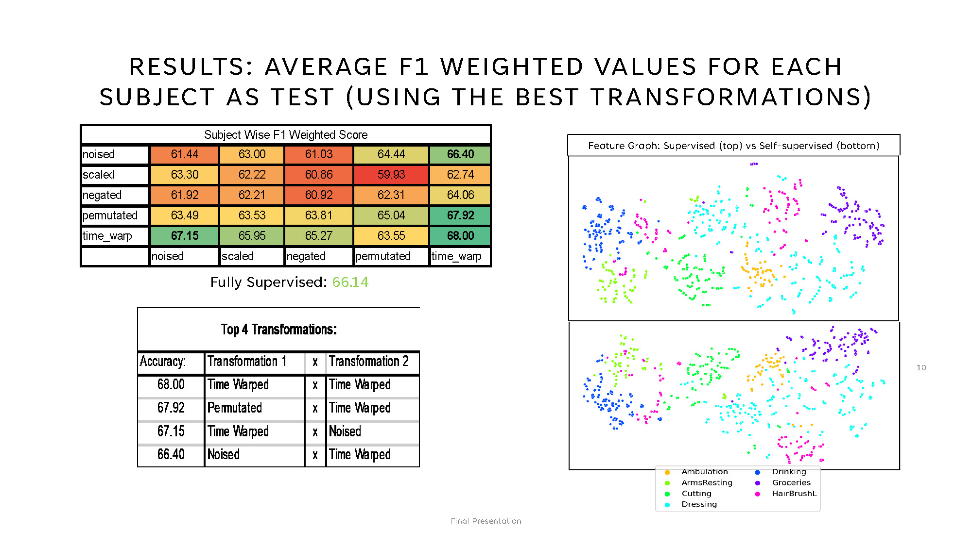
RESULTS: AVERAGE F1 WEIGHTED VALUES FOR EACH SUBJECT AS TEST (USING THE BEST TRANSFORMATIONS)
This page contains a straightforward, factual description of the visible elements in the provided image.
Left side (tables)
1. Subject Wise F1 Weighted Score
A heatmap-style table labeled "Subject Wise F1 Weighted Score" with five rows named:
noised, scaled, negated,
permutated, and time_warp.
The table shows numeric values from about 59.93 to 68.00 and uses color-coded
cells.
Below the table, the text reads: "Fully Supervised: 66.14" in green.
2. Top 4 Transformations
A second table labeled "Top 4 Transformations:" with columns Accuracy, Transformation 1, and Transformation 2. It lists four rows of results with accuracies ranging from 66.40 to 68.00.
| Accuracy | Transformation 1 | Transformation 2 |
|---|---|---|
| 68.00 | Time Warped | Time Warped |
| 67.92 | Permutated | Time Warped |
| 67.15 | Time Warped | Noised |
| 66.40 | Noised | Time Warped |
Right side (plots)
Two scatter plots are stacked vertically under the heading "Feature Graph: Supervised
(top) vs
Self-supervised
(bottom)."
Each plot contains many small colored dots arranged in visible clusters.
Legend (visible categories)
- Ambulation — orange
- ArmsResting — lime green
- Cutting — green
- Dressing — cyan
- Drinking — blue
- Groceries — purple
- HairBrushL — pink
CONCLUSION AND FUTURE WORK
SimCLR showed better results working with Parkinson data than state-of-the-art models, like a fully-supervised model. It provided better accuracy in identifying activities performed by people with Parkinson's disease.
These results can lead to further research in utilizing SimCLR to identify the severity of tremors in patients and be utilized as a tool to distinguish how affected a patient is.
These models can aid healthcare professionals identify the effectiveness of medication.

THANK YOU
Nidhi Begur
nidhibegur@gmail.com
Annelies Verbist
ahve19@gmail.com
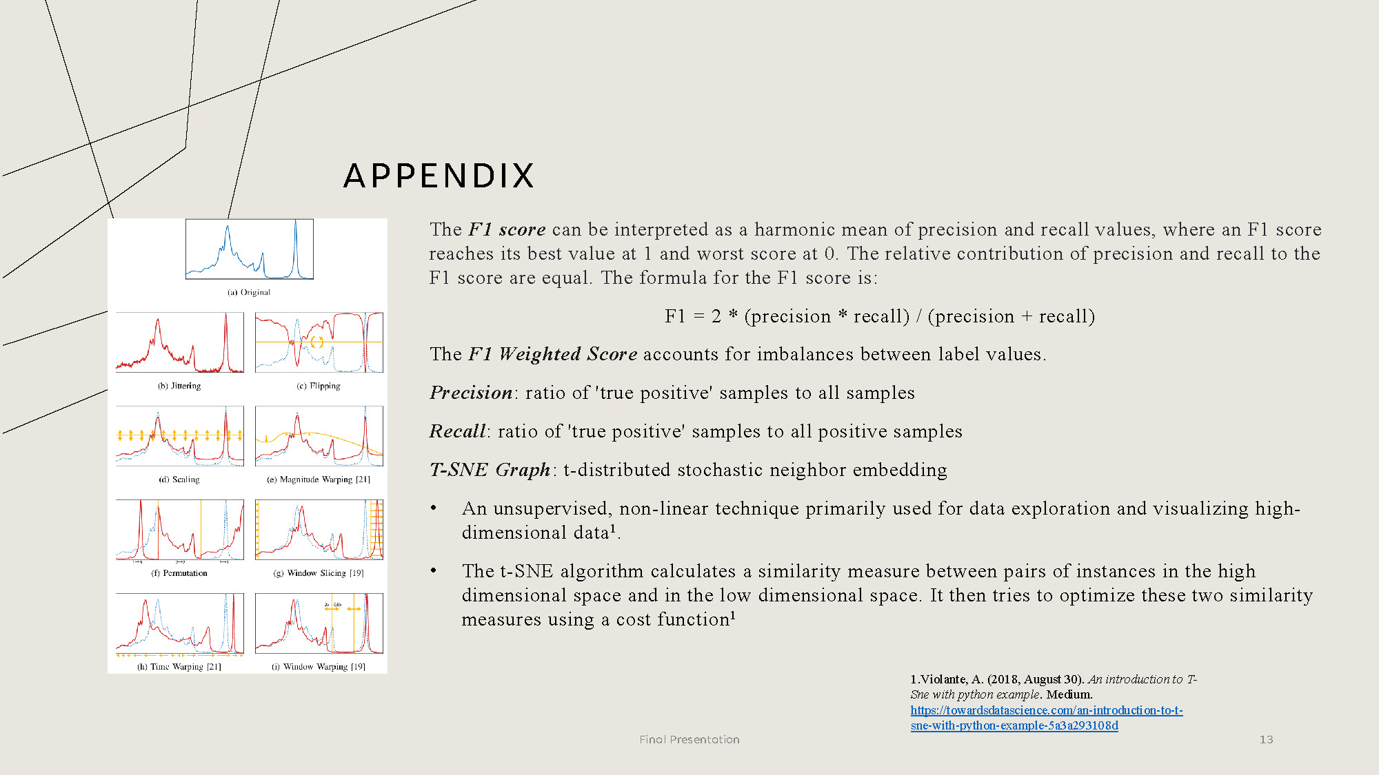
APPENDIX
The F1 score can be interpreted as a harmonic mean of precision and recall values, where an F1 score reaches its best value at 1 and worst score at 0. The relative contribution of precision and recall to the F1 score are equal. The formula for the F1 score is:
F1 = 2 * (precision * recall) / (precision + recall)
The F1 Weighted Score accounts for imbalances between label values.
Precision: ratio of 'true positive' samples to all samples
Recall: ratio of 'true positive' samples to all positive samples
T-SNE Graph: t-distributed stochastic neighbor embedding
• An unsupervised, non-linear technique primarily used for data exploration and visualizing high-dimensional data.
• The t-SNE algorithm calculates a similarity measure between pairs of instances in the high dimensional space and in the low dimensional space. It then tries to optimize these two similarity measures using a cost function.
1.Violante, A. (2018, August 30). An introduction to T-Sne with python example. Medium. https://towardsdatascience.com/an-introduction-to-t-sne-with-python-example-5a3a293108d

End of Presentation
Click the right arrow to return to the beginning of the slide show.
For a downloadable version of this presentation, email: I-SENSE@FAU.