Underwater Communications for Swarm Robotics or Underwater Autonomous Vehicles

Underwater Communications for Swarm Robotics or Underwater Autonomous Vehicles
Paul Scarpinato, Student Researcher

Personal Background
School
- Georgia Tech
- 3rd year
- Major in Biomedical Engineering (BME)
Future
- Neuroprosthesis

Project Overview
- Underwater communications for swarm robotics or Underwater Autonomous Vehicles
- Why?

Testing
- Radios
- Environments
- Methods
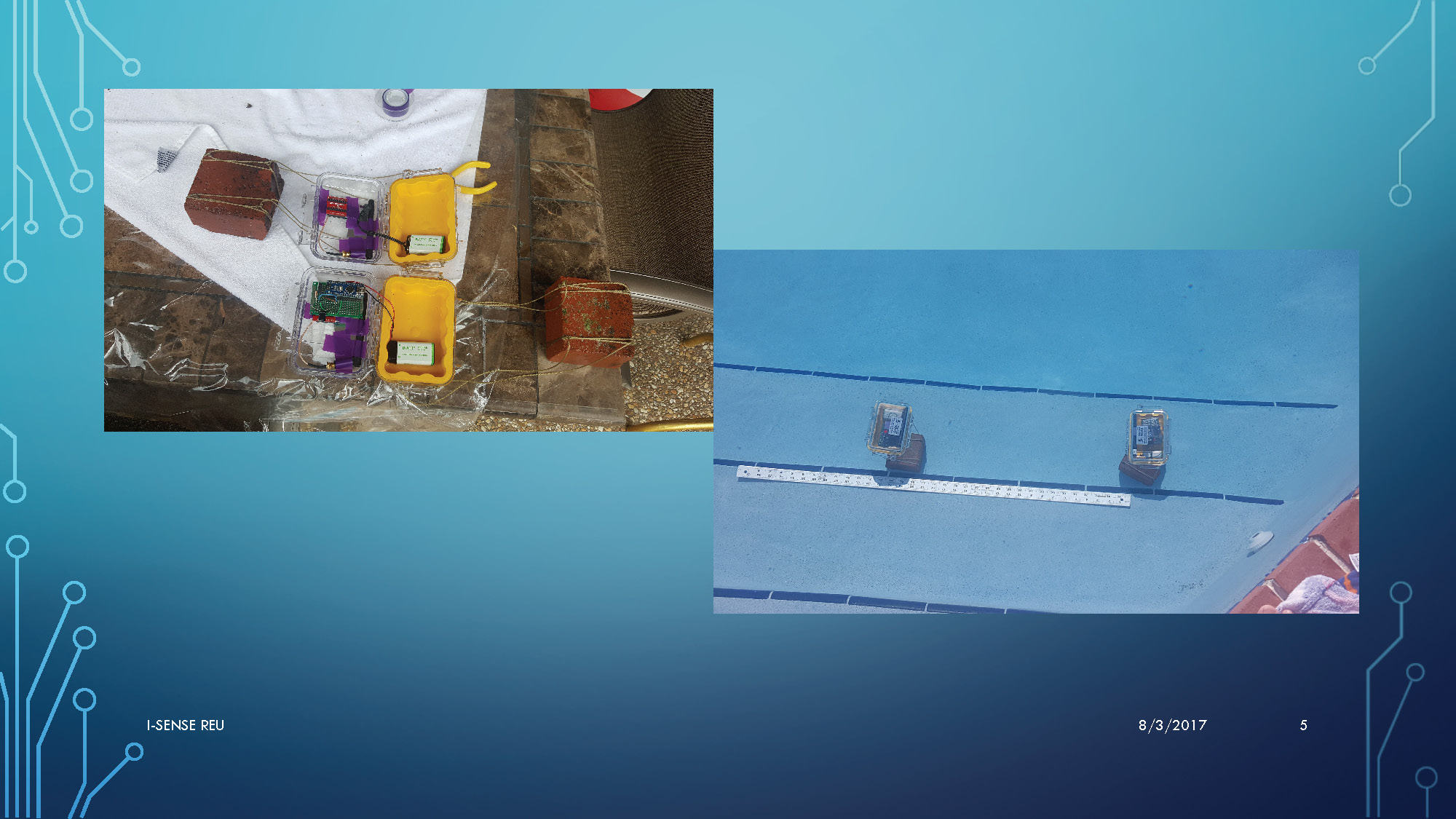
This image shows two main setups. On the left, there are two yellow plastic containers with electronic components inside, connected by wires. The containers are sitting on what appears to be a stone surface with a white towel. On the right, the same two containers are shown submerged in a swimming pool, sitting on a step. A ruler is visible in front of them, showing measurements up to approximately 20 inches.
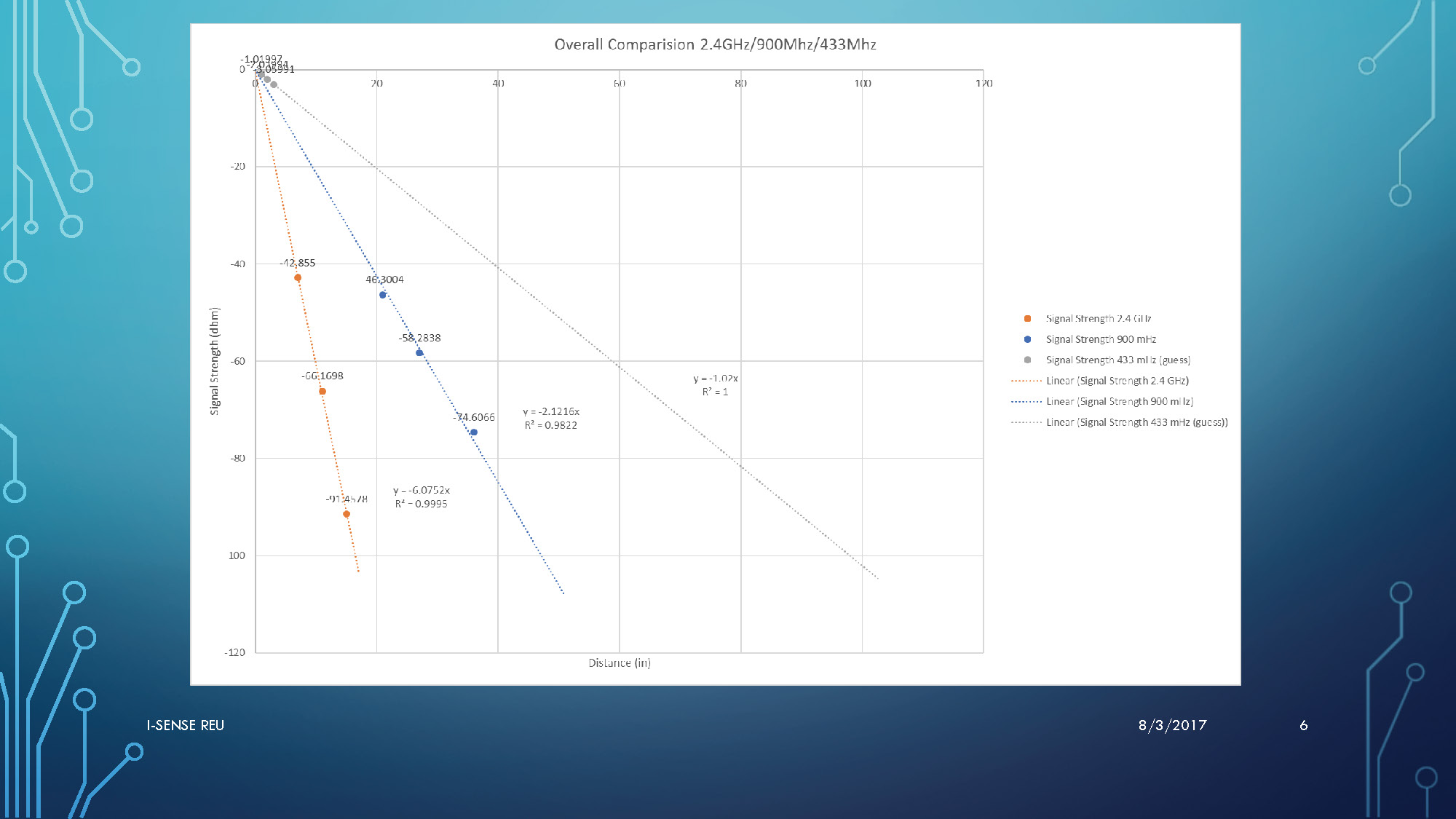
This image displays a line graph titled "Overall Comparision 2.4GHz/900Mhz/433Mhz". The x-axis is labeled "Distance (in)" and ranges from 0 to 170. The y-axis is labeled "Signal Strength (dBm)" and ranges from -120 to 0. Three sets of data points are plotted: blue circles for 2.4 GHz, orange circles for 900 MHz, and gray squares for 433 MHz. Each set has a corresponding linear trendline and equation displayed.
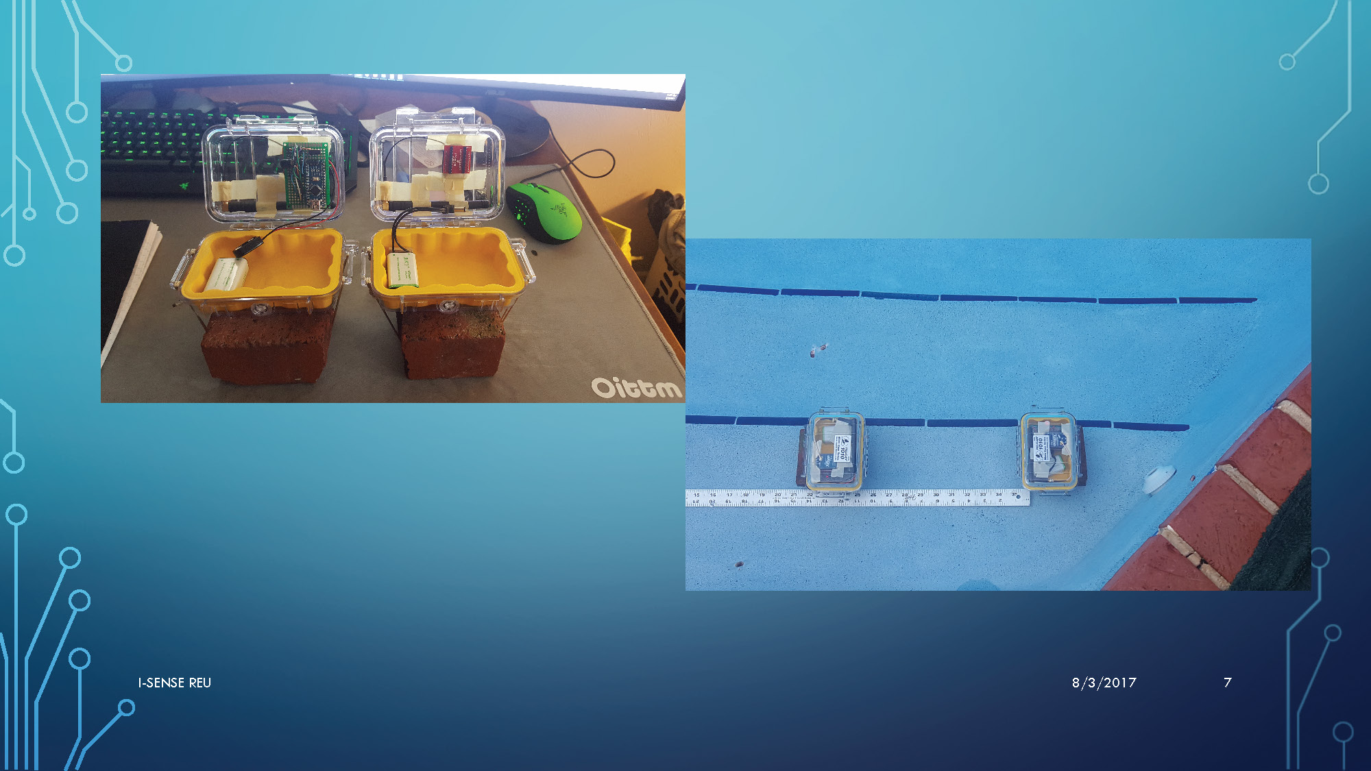
This image shows two main scenes. On the left, two yellow plastic containers with electronic circuits are visible on a desk surface, with a computer monitor and keyboard in the background. A green object resembling a computer mouse is also visible. On the right, the two containers are submerged in a swimming pool, resting on a blue pool step. A measuring tape is stretched out in front of them, showing measurements.
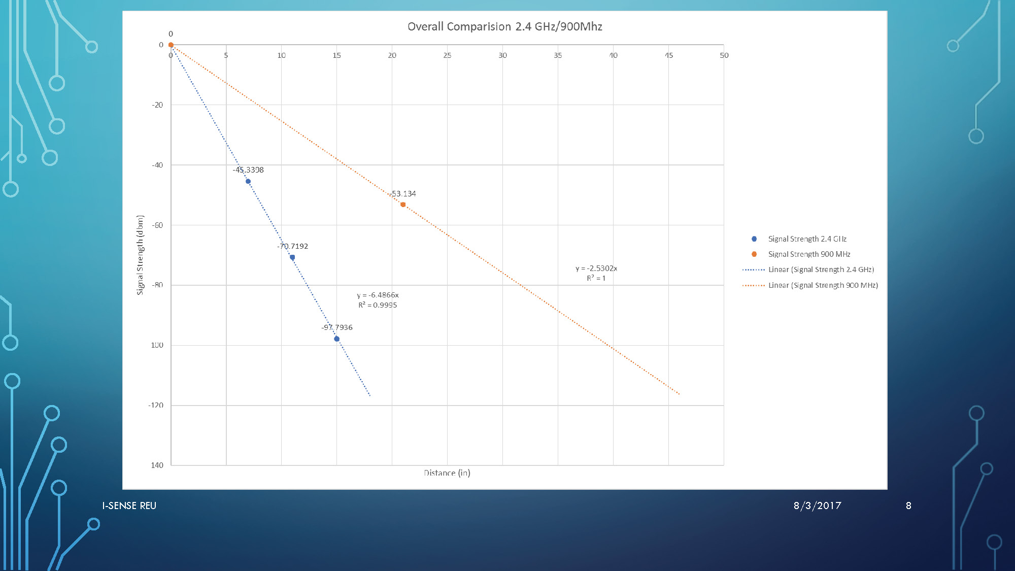
This image shows a line graph titled "Overall Comparision 2.4 GHz/900MHz". The x-axis is "Distance (in)" and the y-axis is "Signal Strength (dBm)". There are two sets of data points: blue circles for 2.4 GHz and orange circles for 900 MHz. A linear trendline with its equation is shown for each dataset.
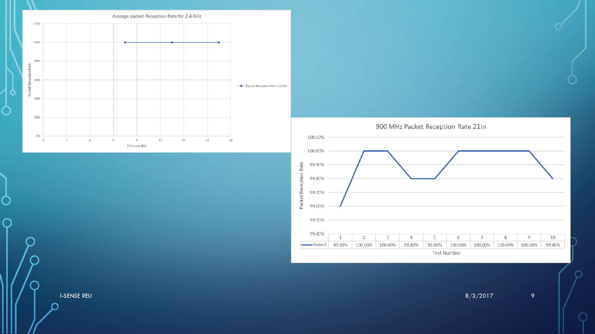
This image contains two separate graphs. The top-left graph is titled "Average packet Reception Rate for 2.4 GHz" and shows a flat line at 100% reception rate across various distances. The bottom-right graph is titled "900 MHz Packet Reception Rate 21in" and displays a fluctuating line showing packet reception rates as a percentage for test numbers 1 through 10. The percentages are all very high, ranging from 99.5% to 100.1%.

Challenges and The Future
- Past problems and how I solved them
- Current problems
- There is still a lot more research and testing to be done.

Special Thanks
- Dr. Jason Hallstrom
- Dr. Jiannan Zhai
- Chancey Kelly
End of Presentation
Click the right arrow to return to the beginning of the slide show.
For a downloadable version of this presentation, email: I-SENSE@FAU.