Scenario Based Evaluation Of Urban Traffic
I-SENSE REU 2026 · FLORIDA ATLANTIC UNIVERSITY
Digital Twin-Based Evaluation of Urban Traffic Systems
Mahfoudh Senhoury
Undergraduate Student in Computer Science at CUNY Lehman College
Mentor: Dr. Jinwoo Jang & Dr Sonia Moshfeghi
July 30, 2026
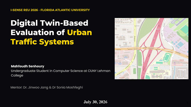
Image: a color street map showing the Glades Road and Airport Road interchange area in Boca Raton, Florida, with highways, ramps, and surrounding roads highlighted in pink.
OVERVIEW
Agenda
The agenda is organized into four columns:
INTRODUCTION: 1. Motivation & background. 2. Research objective. 3. Experimental framework.
METHODS: 1. Tools & architecture. 2. How the simulation works. 3. Case study & FDOT data.
RESULTS: 1. Traffic demand calibration. 2. Baseline validation (GEH). 3. Simulation demonstration. 4. Infrastructure experiment.
CONCLUSION: 1. Conclusion. 2. Live data collection. 3. Impact & future work.
SECTION 01
Introduction
Motivation, objective, and the experimental framework
MOTIVATION · EVIDENCE
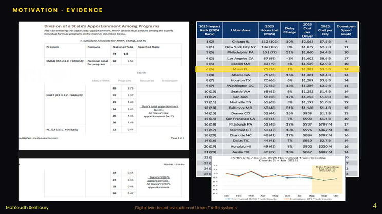
This slide presents two pieces of supporting evidence side by side.
Left: a screenshot of an FHWA document titled "Division of a State's Apportionment Among Programs," describing how FHWA divides a state's total federal-aid apportionment among individual formula programs (CMAQ, NHFP, PL), with a table of program names, formulas, and specified ratios, and a second table of historical apportionment values by fiscal year for PL funding.
Right: a ranked table titled with columns for 2025 Impact Rank (and 2024 Rank in parentheses), Urban Area, 2025 Hours Lost (with 2024 value in parentheses), Delay Change, 2025 Cost per Driver, 2025 Cost per City, and Downtown Speed (mph). Selected rows include: Chicago IL ranked 1, 112 hours lost, 10% delay change, $2,063 cost per driver, $7.5B cost per city, 9 mph downtown speed. New York City NY ranked 2, 102 hours, 0% change, $1,879, $9.7B, 11 mph. Philadelphia PA ranked 3, 101 hours, 31% change, $1,860, $4.4B, 10 mph. Los Angeles CA ranked 4, 87 hours, -1% change, $1,602, $8.6B, 17 mph. Boston MA ranked 5, 83 hours, 5% change, $1,529, $2.9B, 10 mph. Miami FL, highlighted in yellow, ranked 6, 75 hours, 1% change, $1,381, $3.5B, 14 mph. The table continues with additional cities including Atlanta, Houston, Washington DC, Seattle, San Juan, Nashville, Baltimore, Denver, San Francisco, Pittsburgh, Stamford, Charlotte, Dallas, Honolulu, and Austin.
Below the table is a line chart titled "INRIX U.S. / Canada 2025 Normalized Truck Crossing Counts (1 = Jan 2025)," with a vertical axis from about 0.5 to 1.2 and a horizontal axis of months from January through October. Two lines are plotted: normalized INRIX truck counts (blue) and normalized BTS truck counts (orange), both roughly following each other and declining gradually through the year, with a shaded region in August through September labeled "Data Reporting Lag Due to Shutdown."
A large yellow highlighted box contains the italicized question: "How can we predict the impact of future infrastructure changes on traffic before implementing them in the real world?"
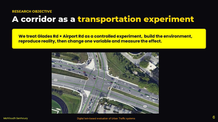
RESEARCH OBJECTIVE
A corridor as a transportation experiment
We treat Glades Rd × Airport Rd as a controlled experiment, build the environment, reproduce reality, then change one variable and measure the effect.
Image: an aerial photograph looking down on the Glades Road and Airport Road intersection, with lane markings for Glades Road highlighted in green, showing multiple lanes of traffic, crosswalks, and a roundabout-style ramp configuration.
SECTION 02
Methods
Tools, architecture, how the simulation works, and the case study
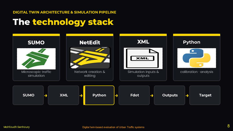
DIGITAL TWIN ARCHITECTURE & SIMULATION PIPELINE
The technology stack
Four tool cards are shown, each with an icon: SUMO – Microscopic traffic simulation. NetEdit – Network creation & editing. XML – Simulation inputs & outputs. Python – calibration · analysis.
Below the cards is a horizontal flow diagram of six connected boxes showing the pipeline order: SUMO → XML → Python → Fdot → Outputs → Target, with the "Python" box outlined to indicate it is the current focus.
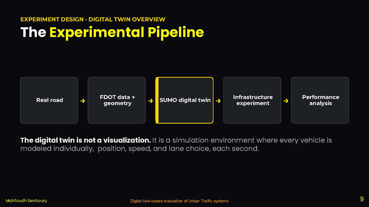
EXPERIMENT DESIGN · DIGITAL TWIN OVERVIEW
The Experimental Pipeline
A five-stage flow diagram: Real road → FDOT data + geometry → SUMO digital twin → Infrastructure experiment → Performance analysis.
The digital twin is not a visualization. It is a simulation environment where every vehicle is modeled individually, position, speed, and lane choice, each second.
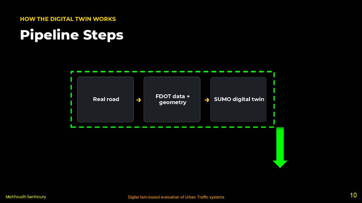
HOW THE DIGITAL TWIN WORKS
Pipeline Steps
A three-stage flow diagram: Real road → FDOT data + geometry → SUMO digital twin.
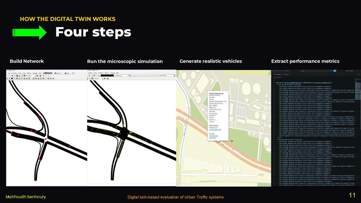
HOW THE DIGITAL TWIN WORKS
Four steps
Four labeled screenshots are shown in sequence: "Build Network" shows a road-network editing tool (NetEdit) displaying an intersection layout with red control points. "Run the microscopic simulation" shows a similar road network in a SUMO simulation window with a traffic-scale control and yellow vehicle markers on the roads. "Generate realistic vehicles" shows a satellite map view of the intersection with a popup information box titled "Portable Traffic Monitoring Site" listing road name, site number, year, description, AADT, site type, class data, K-factor, T-factor, and traffic report links. "Extract performance metrics" shows a screenshot of a text-based XML/log output file with many lines of vehicle trip data, including timestep, edge, position, and speed values.
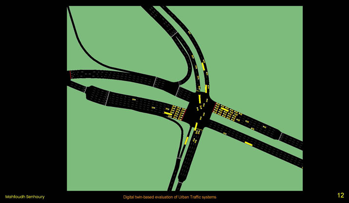
This slide contains no title text, only a full-slide screenshot of the SUMO simulation network for the study intersection. The image shows a green background with black roadways depicting a complex interchange: curved highway ramps merging from the upper right, a signalized intersection near the center, and several branching side roads. Small yellow rectangles scattered along the roads represent vehicles positioned in the simulated network.
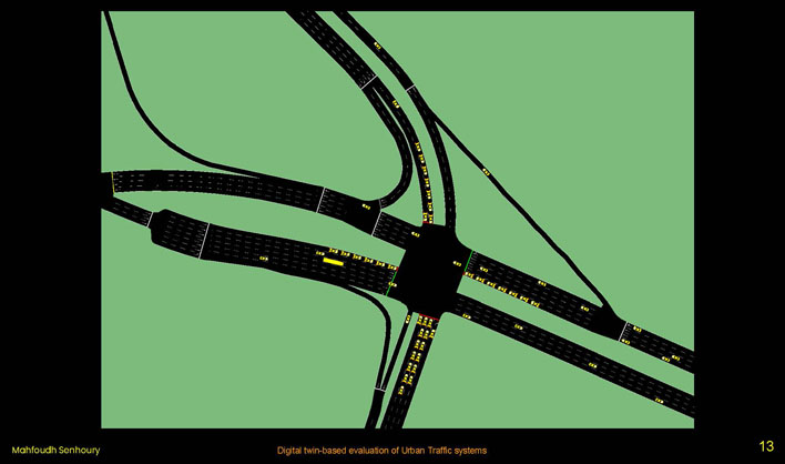
This slide contains no title text, only another full-slide screenshot of the same SUMO simulation network, at a slightly different zoom and vehicle-loading state. More yellow rectangles representing vehicles are visible queued along several of the road approaches leading into the central intersection, including a longer line of vehicles along one of the ramps.

CASE STUDY · FDOT DATA
Anchored to real measurements
LOCATION: Glades Rd × Airport Rd, Boca Raton, FL. Airport Rd is the sole northern access to Boca Raton Airport (BCT).
FDOT SITES: 930041 — Glades Road. 937414 — Airport Road.
PEAK-HOUR DEMAND: AADT 50,000 × K 0.090 = 4,500 veh/hr.
SPLIT BY DIRECTION (D 0.582): WB 2,619 / EB 1,881 vph. Airport Rd South: 403 vph.
Left image: a map screenshot showing Annual Average Daily Traffic (AADT) count labels along several road segments near the Glades Road and Airport Road area, with a popup box titled "Daily Traffic Info" listing Road Name: GLADES RD, From: NW 15 AVE, To: N/A, Year: 2025, AADT: 50000, Roadway: 93, Cosite: 9300, County: Palm, and a "Historical AADT" mini chart popup showing values declining from 51,500 in 2021 to 47,000 in 2022, then rising back up through 2023 to 2025.
Right image: a bar chart titled "Peak-Hour Traffic Split, AADT: 50,000 veh/day (K Factor: 0.090 = 4,500 vph)," with a vertical axis labeled "Vehicles Per Hour (vph)" from 0 to 3000, and two bars: Westbound at 2,619 vph and Eastbound at 1,881 vph.
SECTION 03
Results
Calibration, validation, demonstration, and the intervention experiment
SIMULATION DEMONSTRATION
Scenario A in motion
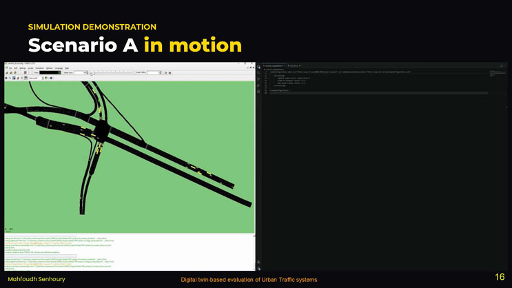
SCENARIO: Connector Road Intervention.
INPUTS: SUMO model. FDOT-calibrated demand. XML configuration.
OUTPUTS: Vehicle behavior. Travel time. Network performance.
A research demo, not a screensaver, the same validated model, one geometry change.
Image: a screenshot of the SUMO-GUI simulation application running the road network for the study intersection, with a vehicle-speed and time control bar at the top, a road network view on the left showing yellow vehicles on the roads, and an XML configuration text panel open on the right side of the window.
BASELINE VALIDATION
Validated against FDOT counts
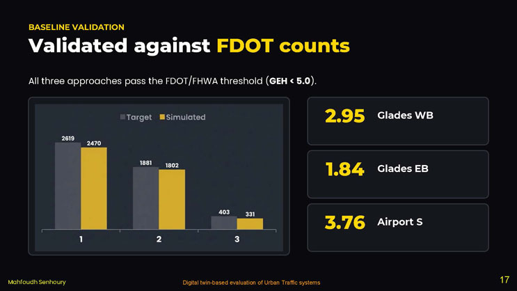
All three approaches pass the FDOT/FHWA threshold (GEH < 5.0).
Bar chart comparing Target (gray) and Simulated (yellow) traffic volumes for three numbered approaches: Approach 1: Target 2,619, Simulated 2,470. Approach 2: Target 1,881, Simulated 1,802. Approach 3: Target 403, Simulated 331.
Three GEH statistic values are called out beside the chart: 2.95 for Glades WB, 1.84 for Glades EB, and 3.76 for Airport S.
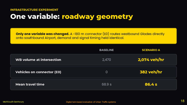
INFRASTRUCTURE EXPERIMENT
One variable: roadway geometry
Only one variable was changed. A ~180 m connector (E0) routes westbound Glades directly onto southbound Airport, demand and signal timing held identical.
| Metric | BASELINE | SCENARIO A |
|---|---|---|
| WB volume at intersection | 2,470 | 2,074 veh/hr |
| Vehicles on connector (E0) | 0 | 382 veh/hr |
| Mean travel time | 68.9 s | 86.4 s |
SECTION 04
Conclusion
Key finding, live data collection, and future work
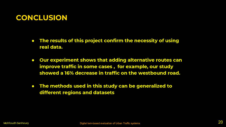
Conclusion
- The results of this project confirm the necessity of using real data.
- Our experiment shows that adding alternative routes can improve traffic in some cases, for example, our study showed a 16% decrease in traffic on the westbound road.
- The methods used in this study can be generalized to different regions and datasets
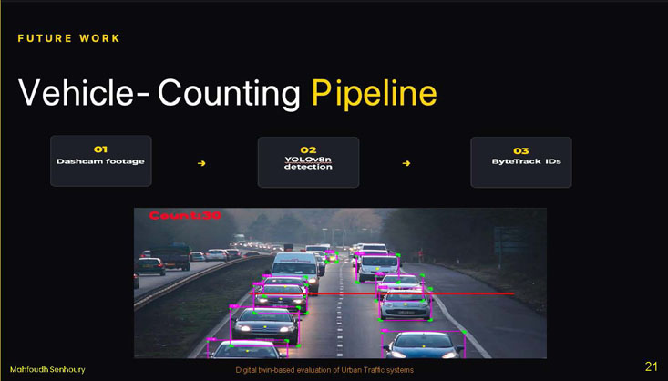
FUTURE WORK
Vehicle-Counting Pipeline
A three-step flow diagram: 01 Dashcam footage → 02 YOLOv8n detection → 03 ByteTrack IDs.
Image: a dashcam photograph of a multi-lane road at dusk with oncoming traffic, overlaid with pink bounding boxes and tracking labels around several vehicles, and a red text overlay in the upper left reading "Count:30" indicating the running vehicle count from the detection and tracking pipeline.
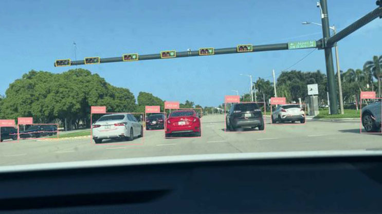
This slide contains no title text, only a full-slide photograph taken from the dashboard of a car approaching an intersection on a sunny day, with tree-lined streets. Multiple vehicles ahead (a white sedan, a red car, a black SUV, a white SUV, and others) are outlined with pink bounding boxes labeled with detection confidence scores. Overhead, a row of traffic signal heads is outlined with yellow bounding boxes. A green street sign reading "Airport Rd" with a right-turn arrow is visible in the upper right of the image.
ACKNOWLEDGMENTS
Thank you
We want to express our gratitude the National Science Foundation (NSF) and Center for Smart Streetscapes (CS3) under NSF Cooperative Agreement No. EEC-2133516, the Institute for Smarter Cities, Spaces and Health (I-SENSE), and CUNY Lehman College.
Dr. Jinwoo Jang & Dr Sonia Moshfeghi, Research Mentor
Research team: Randy Amparo · Cyrus Khan · Vedant Sundriyal
Logos shown: National Science Foundation (NSF), Center for Smart Streetscapes, Florida Atlantic University I-SENSE: The Institute for Smarter Cities, Spaces, and Health, and Lehman College.
End of Presentation
Click the right arrow to return to the beginning of the slide show.
For a downloadable version of this presentation, email: I-SENSE@FAU.