Quantitative Measurement of Driver Path Choice Changes Using Attributed Graph Networks

Quantifying Driver Route Choice Behavior
REU Scholar: Cyrus Khan
REU Scholar Home Institution: University of California, Riverside (Riverside, CA)
REU Mentor: Jinwoo Jang, Ph.D.
REU Co-Mentor: Mojtaba Jafarian Abyaneh, Ph.D. Candidate.
REU Site: FAU I-SENSE

Presentation Outline
- Introduction
- Methodology
- Conclusion
- Index
Cyrus Khan

Introduction
Cyrus Khan
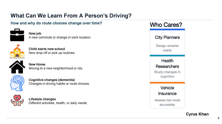
What Can We Learn From A Person's Driving?
How and why do route choices change over time?
- New job: A new commute or change in work location.
- Child starts new school: New drop off or pick up routines.
- New Home: Moving to a new neighborhood or city.
- Cognitive changes (dementia): Changes in driving habits or route choices.
- Lifestyle changes: Different activities, health, or daily needs.
Who Cares?
A three-part diagram identifying stakeholders in this research:
- City Planners: Design smarter roads
- Health Researchers: Study changes in cognition
- Vehicle Insurance: Assess risk more accurately
Cyrus Khan
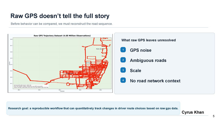
Raw GPS doesn't tell the full story
Before behavior can be compared, we must reconstruct the road sequence.
A map titled "Raw GPS Trajectory Dataset (4.68 Million Observations)" shows dense red points tracing roads across Palm Beach, Broward, and Miami-Dade areas of Florida, plotted by latitude and longitude. The map caption notes the full raw GPS point count is 4,684,252, each red marker represents a raw GPS observation, and the dense overlap is intentional, representing the raw input before map matching.
What raw GPS leaves unresolved
- GPS noise
- Ambiguous roads
- Scale
- No road network context
Research goal: a reproducible workflow that can quantitatively track changes in driver route choices based on raw gps data.
Cyrus Khan

Methodology
Cyrus Khan
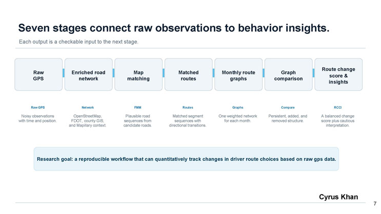
Seven stages connect raw observations to behavior insights.
Each output is a checkable input to the next stage. The pipeline flows left to right through seven labeled stages:
- Raw GPS: Noisy observations with time and position.
- Enriched road network: OpenStreetMap, FDOT, county GIS, and Mapillary context.
- Map matching (FMM): Plausible road sequences from candidate roads.
- Matched routes: Matched segment sequences with directional transitions.
- Monthly route graphs: One weighted network for each month.
- Graph comparison: Persistent, added, and removed structure.
- Route change score and insights (RCCI): A balanced change score plus cautious interpretation.
Research goal: a reproducible workflow that can quantitatively track changes in driver route choices based on raw gps data.
Cyrus Khan
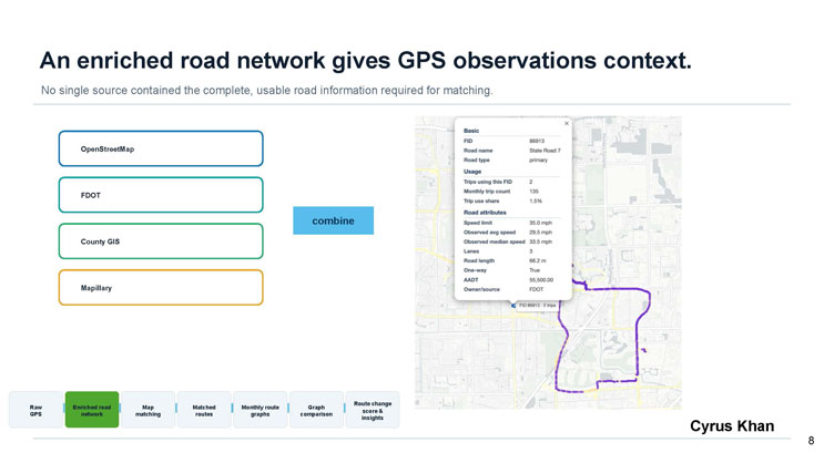
An enriched road network gives GPS observations context.
No single source contained the complete, usable road information required for matching.
Four labeled boxes, OpenStreetMap, FDOT, County GIS, and Mapillary, feed into a "combine" step.
A map popup for a sample road segment shows the following attributes: FID 86913, Road name State Road 7, Road type primary, Trips using this FID 2, Monthly trip count 135, Trip use share 1.5%, Speed limit 35.0 mph, Observed avg speed 29.5 mph, Observed median speed 33.5 mph, Lanes 3, Road length 66.2 m, One-way True, AADT 55,500.00, Owner/source FDOT.
A pipeline strip along the bottom highlights the current stage, "Enriched road network," among the seven stages: Raw GPS, Enriched road network, Map matching, Matched routes, Monthly route graphs, Graph comparison, Route change score and insights.
Cyrus Khan
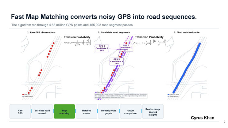
Fast Map Matching converts noisy GPS into road sequences.
The algorithm ran through 4.68 million GPS points and 455,923 road segment passes.
Three panels illustrate the process: (1) Raw GPS observations shown as red dots near a road network; (2) Candidate road segments, showing three candidate matches for a sample GPS point (GPS 3), with Candidate 1 at 50%, Candidate 2 at 26%, and Candidate 3 at 24% probability, alongside the Emission Probability and Transition Probability formulas; (3) Final matched route, shown as a single blue line following the road network.
A caption explains that for every GPS observation, FMM identifies nearby candidate road segments, the candidates are scored individually, and the highest-scoring connected sequence becomes the final matched route.
A pipeline strip highlights the current stage, "Map matching," among the seven stages.
Cyrus Khan
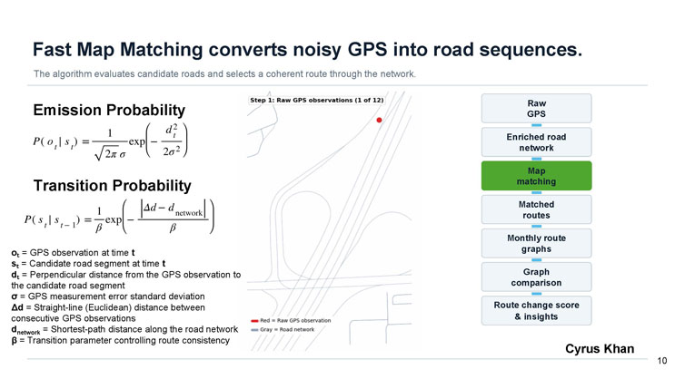
Fast Map Matching converts noisy GPS into road sequences.
The algorithm evaluates candidate roads and selects a coherent route through the network.
Emission Probability formula: P(o sub t given s sub t) equals one over the square root of two pi sigma, times the exponential of negative d sub t squared over two sigma squared.
Transition Probability formula: P(s sub t given s sub t minus 1) equals one over beta, times the exponential of negative the absolute value of (delta d minus d sub network) over beta.
Variable definitions:
- o sub t = GPS observation at time t
- s sub t = Candidate road segment at time t
- d sub t = Perpendicular distance from the GPS observation to the candidate road segment
- sigma = GPS measurement error standard deviation
- delta d = Straight-line (Euclidean) distance between consecutive GPS observations
- d sub network = Shortest-path distance along the road network
- beta = Transition parameter controlling route consistency
A small map labeled "Step 1: Raw GPS observations (1 of 12)" shows a single red dot near a gray road network, with a legend indicating red equals raw GPS observation and gray equals road network.
A pipeline strip on the right lists all seven stages with "Map matching" highlighted as the current stage.
Cyrus Khan
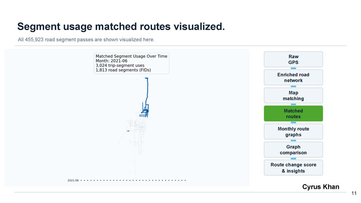
Segment usage matched routes visualized.
All 455,923 road segment passes are shown visualized here.
A map titled "Matched Segment Usage Over Time" for Month 2021-06 shows blue matched route lines tracing a driver's road usage, with a data box reporting 3,024 trip-segment uses and 1,813 road segments (FIDs). A timeline of dots below the map marks the month 2021-06 among a longer sequence of months.
A pipeline strip on the right lists all seven stages with "Matched routes" highlighted as the current stage.
Cyrus Khan
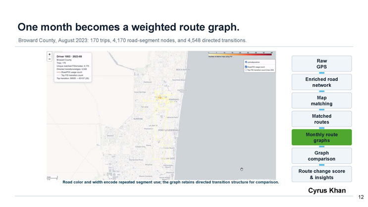
One month becomes a weighted route graph.
Broward County, August 2023: 170 trips, 4,170 road-segment nodes, and 4,548 directed transitions.
A map of the Broward County coastal area, spanning Boca Raton to Aventura, shows yellow-to-red road usage lines for Driver 1003 in 2023-08. A data box lists: Trips 170; Unique matched FIDs/nodes 4,170; Directed transitions/edges 4,548; and Top transition 59555 to 83107 (35 uses). A legend explains a color scale from 1 to 48+ for the "Number of distinct trips using FID," plus toggles for road/FID usage count and top FID transition count (max 250).
Caption: Road color and width encode repeated segment use; the graph retains directed transition structure for comparison.
A pipeline strip highlights the current stage, "Monthly route graphs," among the seven stages.
Cyrus Khan
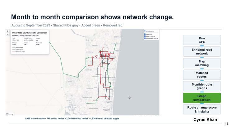
Month to month comparison shows network change.
August to September 2023, shared FIDs shown gray, added shown green, removed shown red.
A map of the Broward County coastal area shows Driver 1003's county-specific comparison from 2023-08 to 2023-09. A data box lists: Trips 170 to 110; Unique FIDs 4,170 to 2,672; Quality "ok"; Shared 1,926; Added 746; Removed 2,244. The map legend distinguishes shared FIDs (gray), added FIDs (green), and removed FIDs (red).
Caption: 1,926 shared nodes, 746 added nodes, 2,244 removed nodes, 1,934 shared directed edges.
A pipeline strip highlights the current stage, "Graph comparison," among the seven stages.
Cyrus Khan
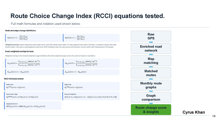
Route Choice Change Index (RCCI) equations tested.
Full math formulas and notation used shown below.
Node and edge change definitions
N sub c(t, t+1) equals 1 minus the size of the intersection of V sub t and V sub t+1, divided by the size of the union of V sub t and V sub t+1.
E sub c(t, t+1) equals 1 minus the size of the intersection of E sub t and E sub t+1, divided by the size of the union of E sub t and E sub t+1.
Weighted overlap means frequently used roads count more than rarely used roads. If a road segment was used in 40 trips, a change involving that road should matter more than a road segment used once. RCCI therefore uses trip-use counts and transition counts rather than treating every FID equally.
Exact weighted overlap formula
Weighted overlap is the shared weighted usage divided by the total weighted usage across the union of roads or transitions.
O sub V,w(t, t+1) equals the sum over v in the union of V sub t and V sub t+1 of the minimum of w sub v superscript t and w sub v superscript t+1, divided by the sum of the maximum of the same terms.
O sub E,w(t, t+1) is defined analogously for edges e.
N sub c,w(t, t+1) equals 1 minus O sub V,w(t, t+1). E sub c,w(t, t+1) equals 1 minus O sub E,w(t, t+1).
RCCI formulas tested
- Node-only: R sub c superscript node(t, t+1) equals N sub c(t, t+1).
- Edge-only: R sub c superscript edge(t, t+1) equals E sub c(t, t+1).
- Equal node-edge: R sub c superscript equal(t, t+1) equals 0.5 N sub c(t, t+1) plus 0.5 E sub c(t, t+1).
- General weighted: R sub c superscript alpha(t, t+1) equals alpha N sub c(t, t+1) plus (1 minus alpha) E sub c(t, t+1), where alpha is in {0, 0.25, 0.50, 0.75, 1.00}.
- Reported RCCI v1: RCCI sub v1(t, t+1) equals 100 times [0.5 N sub c,w(t, t+1) plus 0.5 E sub c,w(t, t+1)].
A pipeline strip highlights the current stage, "Route change score and insights," among the seven stages.
Cyrus Khan
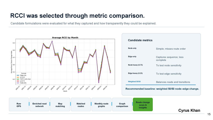
RCCI was selected through metric comparison.
Candidate formulations were evaluated for what they captured and how transparently they could be explained.
A line chart titled "Average RCCI by Month" plots the Average Route Choice Change Index on the y-axis (roughly 0.3 to 0.9) against Month on the x-axis, spanning 2021-07 through 2024-05. Five nearly overlapping lines represent the formulas Edge-only, alpha=0.25, 50/50 node-edge, alpha=0.75, and Node-only, all closely tracking each other with peaks around 2022-09 (about 0.9) and troughs around 2023-11 to 2024-01 and near 2024-03 (dropping toward 0.35-0.4), showing the different weightings produce very similar overall trends.
Candidate metrics
- Node only: Simple; misses route order
- Edge only: Captures sequence; less complete
- Node heavy (0.75): To test node sensitivity
- Edge heavy (0.25): To test edge sensitivity
- Weighted 50/50: Balances roads and transitions
Recommended baseline: weighted 50/50 node-edge change.
A pipeline strip highlights the current stage, "Route change score and insights," among the seven stages.
Cyrus Khan
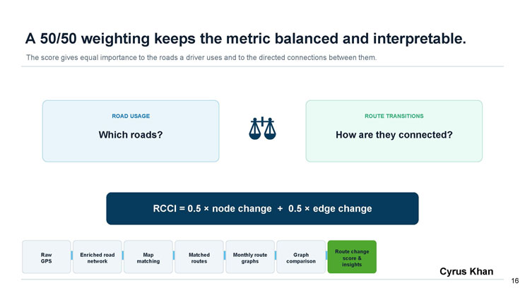
A 50/50 weighting keeps the metric balanced and interpretable.
The score gives equal importance to the roads a driver uses and to the directed connections between them.
A balance-scale icon sits between two boxes: "Road Usage: Which roads?" on the left and "Route Transitions: How are they connected?" on the right.
The formula is displayed prominently: RCCI = 0.5 × node change + 0.5 × edge change.
A pipeline strip highlights the current stage, "Route change score and insights," among the seven stages.
Cyrus Khan
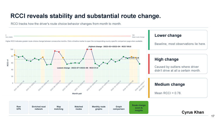
RCCI reveals stability and substantial route change.
RCCI tracks how the driver's route choice behavior changes from month to month.
A line chart plots RCCI v1 (y-axis, 0 to 100, labeled "0 Very stable" to "100 Major route change") against Month pair on the x-axis, spanning from 2021-09 to 2024 to 2024-04 to 2024-05. Points are shaded green, orange, or red depending on the amount of change, with a dashed horizontal line marking the mean RCCI of 70.8. The chart is annotated with "Highest change: 2023-03 to 2023-04, RCCI 100.0" and "Lowest change: 2023-07 to 2023-08, RCCI 51.0." The chart caption explains that higher RCCI indicates greater route-choice change between consecutive months, and clicking a timeline marker opens the corresponding county-specific comparison page when available.
Legend
- Lower change (green): Baseline, most observations lie here.
- High change (red): Caused by outliers where driver didn't drive at all a certain month.
- Medium change (orange): Mean RCCI = 0.78.
A pipeline strip highlights the current stage, "Route change score and insights," among the seven stages.
Cyrus Khan
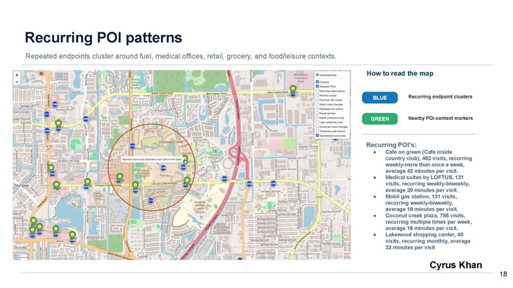
Recurring POI patterns
Repeated endpoints cluster around fuel, medical offices, retail, grocery, and food/leisure contexts.
A map of the Coconut Creek and Margate area of Florida shows numbered blue markers for recurring endpoint clusters and green markers for nearby POI-context markers, with a highlighted circle around a cluster near "Wynmoor community destination near Cafe on the Green."
How to read the map
- Blue: Recurring endpoint clusters
- Green: Nearby POI-context markers
Recurring POI's
- Cafe on green (Cafe inside country club): 462 visits, recurring weekly to more than once a week, average 42 minutes per visit.
- Medical suites by LOFTUS: 121 visits, recurring weekly to biweekly, average 20 minutes per visit.
- Mobil gas station: 131 visits, recurring weekly to biweekly, average 19 minutes per visit.
- Coconut creek plaza: 785 visits, recurring multiple times per week, average 16 minutes per visit.
- Lakewood shopping center: 40 visits, recurring monthly, average 33 minutes per visit.
Cyrus Khan
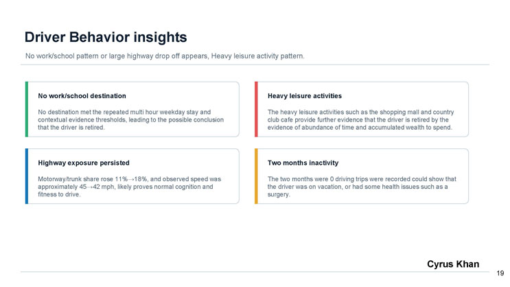
Driver Behavior insights
No work/school pattern or large highway drop off appears; heavy leisure activity pattern.
No work/school destination
No destination met the repeated multi hour weekday stay and contextual evidence thresholds, leading to the possible conclusion that the driver is retired.
Heavy leisure activities
The heavy leisure activities such as the shopping mall and country club cafe provide further evidence that the driver is retired by the evidence of abundance of time and accumulated wealth to spend.
Highway exposure persisted
Motorway/trunk share rose 11% to 18%, and observed speed was approximately 45 to 42 mph, likely proves normal cognition and fitness to drive.
Two months inactivity
The two months where 0 driving trips were recorded could show that the driver was on vacation, or had some health issues such as a surgery.
Cyrus Khan

Conclusion
Cyrus Khan
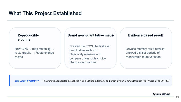
What This Project Established
- Reproducible pipeline: Raw GPS to map matching to route graphs to Route change metric.
- Brand new quantitative metric: Created the RCCI, the first ever quantitative method to objectively measure and compare driver route choice changes across time.
- Evidence based result: Driver's monthly route network showed distinct periods of measurable route variation.
Acknowledgment: This work was supported through the NSF REU Site in Sensing and Smart Systems, funded through NSF Award CNS-2447437.
Cyrus Khan
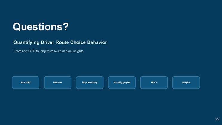
Questions?
Quantifying Driver Route Choice Behavior
From raw GPS to long term route choice insights
Flow diagram: Raw GPS → Network → Map matching → Monthly graphs → RCCI → Insights

Index

Link to Github
A QR code image is displayed for scanning to reach the project's GitHub page.
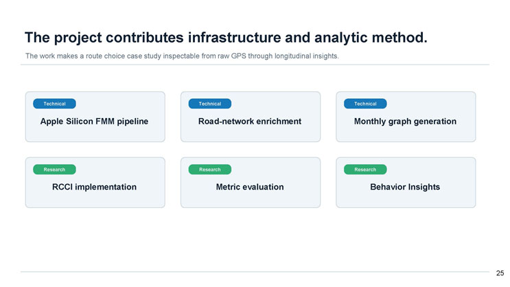
The project contributes infrastructure and analytic method.
The work makes a route choice case study inspectable from raw GPS through longitudinal insights.
Technical
- Apple Silicon FMM pipeline
- Road-network enrichment
- Monthly graph generation
Research
- RCCI implementation
- Metric evaluation
- Behavior Insights
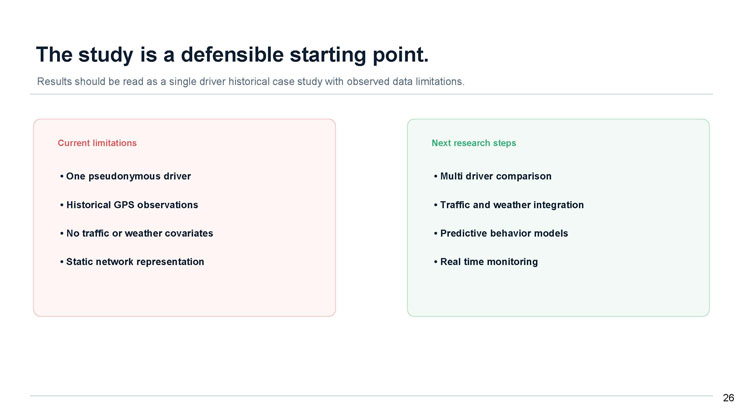
The study is a defensible starting point.
Results should be read as a single driver historical case study with observed data limitations.
Current limitations
- One pseudonymous driver
- Historical GPS observations
- No traffic or weather covariates
- Static network representation
Next research steps
- Multi driver comparison
- Traffic and weather integration
- Predictive behavior models
- Real time monitoring
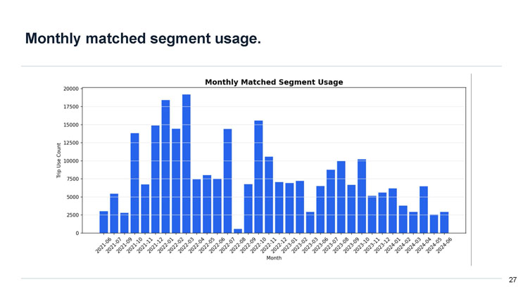
Monthly matched segment usage.
A bar chart titled "Monthly Matched Segment Usage" plots Trip Use Count (y-axis, 0 to 20,000) against Month (x-axis, 2021-06 through 2024-06). Usage is low in mid-to-late 2021 (roughly 3,000 to 5,000), rises sharply from late 2021 into early 2022, peaking near 19,000 around 2022-02, drops to near 0 in 2022-07, rebounds to about 15,500 in 2022-09, then generally trends downward through 2023 and 2024 with values mostly ranging between about 2,500 and 10,000 trip uses per month, ending around 3,000 by 2024-06.
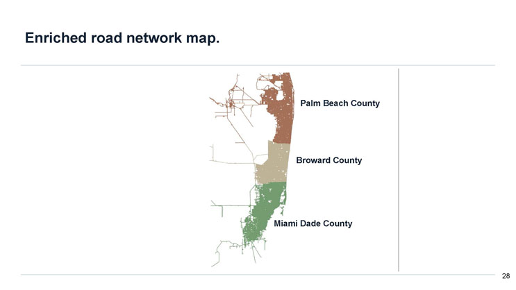
Enriched road network map.
A map of southeast Florida shows the enriched road network divided into three color-coded county regions, stacked vertically: Palm Beach County (brown, north), Broward County (tan, middle), and Miami-Dade County (green, south).
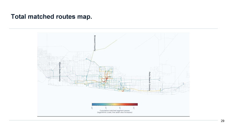
Total matched routes map.
A map spanning Miami-Dade County, Broward County, and Palm Beach County shows the full road network in light gray with matched route segments overlaid in a blue-to-red color gradient representing cumulative matched segment passes on a logarithmic scale (ranging roughly from 10 to the 0 power up to 10 to the 3 power); line width also increases with usage. The heaviest, reddest usage clusters appear in a concentrated area within Broward County, with lighter blue and green trails extending along a few corridors into Miami-Dade and Palm Beach counties.
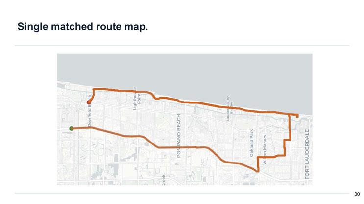
Single matched route map.
A street map shows a single matched route in orange, starting near a green marker inland, traveling east and then jogging south along local streets through Pompano Beach, near Oakland Park and Wilton Manors, before turning north along the coastline through Lauderdale-by-the-Sea toward a red marker near Deerfield Beach and Lighthouse Point. Nearby labeled areas include Pompano Beach, Oakland Park, Wilton Manors, Lauderdale-by-the-Sea, Lighthouse Point, Deerfield Beach, and Fort Lauderdale.

End of Presentation
Click the right arrow to return to the beginning of the slide show.
For a downloadable version of this presentation, email: I-SENSE@FAU.